
Home
Product site — myguitare.com
👩🏼💻 My role
As a Senior Designer, I led the redesign of the MyGuitare platform from ideation to delivery.
I conducted user research, created wireframes and prototypes, and developed a cohesive visual design. I facilitated usability testing and collaborated with cross-functional teams to ensure seamless integration.
👨🏾💻👩💻 Team
Natalia Tarasova, Senior Product Designer
Yuki Nishida, UX/UI Designer
Charlotte Chen, Junior Product Designer
Leo Chazalon, Product Manager
Abdellah Rholem, Branding
Nick Lighter, Project Coordinator
The business problem
⛔️ The user lifecycle is ≈2 months.
⛔️ After ≈2 months, users stopped purchasing courses.
⛔️ Excessive strain on technical support.
By conducting user interviews, gathering metrics data, and analyzing competing platforms, I quickly identified user drop-off points. These insights helped me determine the next steps and were included in a presentation for cross-platform departments.
80%
the respondents don't know which course to buy to achieve their goal.
77%
users abandon the payment process when selecting parts of the course.
90%
users feel frustrated by having to wait for the video to load.

Presentation for Cross-Platform Departments

Competitor Analysis

User Interviews
After discussing with the marketing and strategy teams, we set a goal to increase the learning cycle of students from 2 months to 6 months by enhancing the user experience.
Solution
To address the issues, I identified the root cause of each problem and resolved it.
🟠 Root cause
Users didn't know which course was right for them.
🟢 Solution
I suggested creating an onboarding process that recommends 2-5 courses based on their responses.

Personalized recommendations of relevant guitar courses to assist users get started.
🌟 Justification
This design decision is grounded in the need to provide a personalized and guided experience for users. By recommending courses tailored to their responses, we can significantly reduce the uncertainty and improve user satisfaction.
This approach helps users start their learning journey with confidence, leading to higher engagement and course completion rates.
The decision was informed by user feedback, which highlighted the difficulty in selecting appropriate courses, and aims to create a smoother, more intuitive onboarding experience.

Onboarding scenario
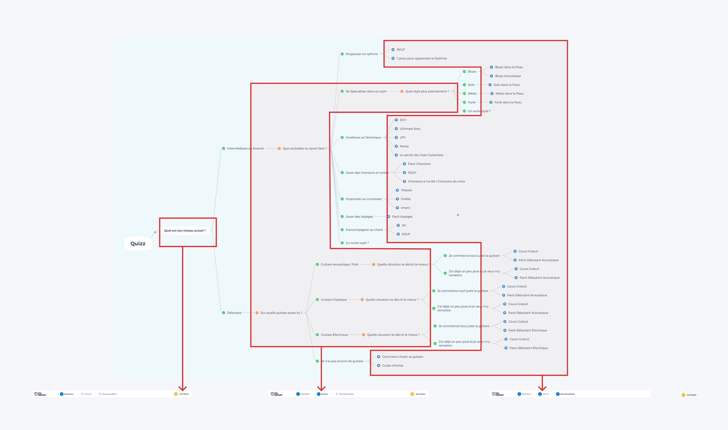
Quiz flow
🟠 Root cause
Students didn't understand how to purchase only part of a course instead of the whole course, or how to buy VIP access for just a part.
🟢 Solution
Create a clear path from the course page to purchasing a part of the course, with an option to choose VIP features for a specific part

Selecting a portion of a course to purchase (module), VIP access add-on, payment methods, and purchase confirmation.
🌟 Justification
This design decision addresses the need to simplify the purchasing process and increase transparency for users.
By providing a clear pathway for purchasing course parts and choosing VIP features, we eliminate confusion and enhance the user experience.
This allows users to easily select and purchase the specific parts they need, ultimately increasing satisfaction and engagement.
Great challenge
It was a great challenge to incorporate MyGuitare's educational approach, which mandates users spend a week practicing the material and indicate whether they have "Mastered" the current lesson or need "More practice."
🟠 Root cause
Users didn't want to wait a week. This was frustrating and made them feel deceived.
🟢 Solution
Explain the reason for this method, provide clear information on when the block will be lifted, and offer additional materials for study during the waiting period.

Selecting a portion of a course to purchase (module), VIP access add-on, payment methods, and purchase confirmation.

🌟 Justification
This design decision aims to reduce user frustration and increase transparency. By clearly explaining the reason for the waiting period and providing additional study materials, users can better understand and utilize the time effectively.
This approach helps maintain user trust and engagement, making the waiting period more productive and less frustrating.
🟠 Root cause
Users were dropping out of the learning process due to complex navigation that led to dead ends.
🟢 Solution
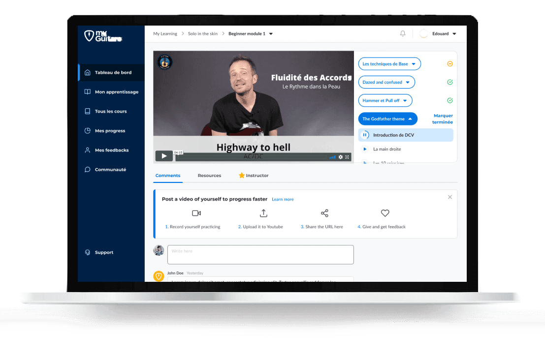
Streamline all paths to lead back to the instructional videos, thus continuously guiding the student back into the learning process.

🌟 Justification
This design decision simplifies navigation, ensuring that users are not frustrated by dead ends.
By continuously guiding students back to the instructional videos, we keep them engaged and focused on their learning goals.
This approach minimizes drop-off rates and enhances the overall user experience, making the learning process smoother and more intuitive.
🟠 Root cause
It was difficult to use VIP access because it required communication outside the platform.
🟢 Solution
Integrate a chat feature into the platform.

🌟 Justification
This design decision enhances the user experience by centralizing all communication within the platform.
By integrating a chat feature, users can easily access VIP support without leaving the platform, making the process more convenient and seamless.
This approach reduces friction, improves user satisfaction, and ensures that users can fully utilize VIP access benefits without any additional hassle.
🟠 Root cause
Overloaded technical support, which was "teaching" users how to navigate the platform.
🟢 Solution
The main cause of the strain on technical support is unclear UX on the platform. Additionally, this can be addressed by creating a FAQ page based on common questions.

🌟 Justification
This design decision enhances the user experience by centralizing all communication within the platform.
By integrating a chat feature, users can easily access VIP support without leaving the platform, making the process more convenient and seamless.
This approach reduces friction, improves user satisfaction, and ensures that users can fully utilize VIP access benefits without any additional hassle.
Wireframes
For testing, I created prototypes and animated them in Figma.

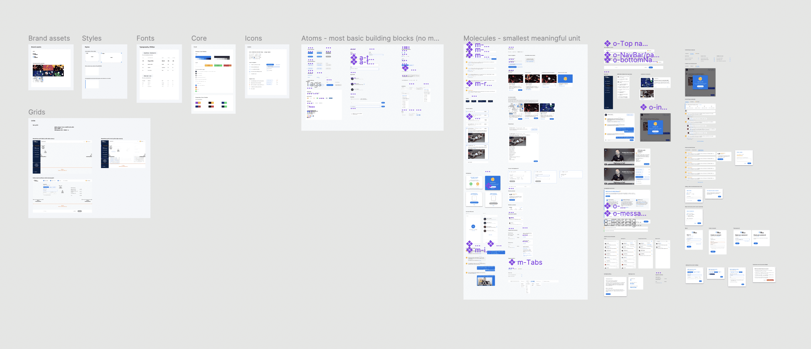
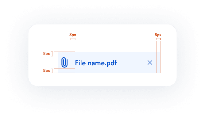
Design system
To ensure all participants worked within a unified visual framework, I created and maintained a design system.
Handoff process
Transferring our design assets to the client's development team presented several obstacles. We faced difficulties due to differing time zones, language differences, and varying collaboration expectations.
Our team favors the "hot potato" approach, which involves frequent communication to quickly resolve any problems, over the traditional waterfall method.
Outcome
Understanding that MyGuitare has a substantial user base for extracting meaningful insights, we set up Google Analytics as the baseline to track the platform's overall performance. Below are the key metrics and indicators we will closely monitor to evaluate each aspect of the redesign.
🌟 Evaluating user lifecycle increase
Average learning duration
Number of completed courses
User return to the learning process
Frequency of visits
Average session duration
🌟 Evaluating information architecture
Indicators of poor IA include:
High bounce rates
Low unique pageviews
High volume of search queries
Good information architecture (IA) helps users understand:
Their current location
Previous locations
Surrounding options and what to expect next.
🌟 Evaluating fundamental user flows
Onboarding:
New user course registrations
Quiz page drop-off rates
Recommended course visits
Course Navigation:
Average session duration of recurring users
User surveys
Usability testing
Resuming a Lesson:
Fewer visits to the "My Courses" page
Limited navigation from the dashboard to a previous lesson
Reflection
Initial Challenges
At the outset, we encountered significant challenges in understanding the unique needs of our diverse user base. MyGuitare’s learners ranged from complete beginners to advanced guitarists, each with distinct expectations and learning paces. This diversity necessitated a flexible and adaptive design approach to cater to various user journeys effectively.
User-Centric Approach
Through extensive user interviews and feedback sessions, we identified key pain points. Users often felt overwhelmed by the sheer volume of content and uncertain about which courses would best suit their skill levels and goals. To address this, we implemented a personalized onboarding process, recommending courses based on users' initial assessments and preferences. This not only streamlined their learning path but also significantly improved user satisfaction and engagement.
Enhancing Navigation and Usability
One of the critical aspects of the redesign was to simplify the platform's navigation. Users frequently reported difficulties in finding relevant content and navigating through the courses. By reorganizing the information architecture and introducing intuitive navigation cues, we aimed to create a seamless user experience. The addition of a clear, step-by-step guide to help users progress through their courses further reduced frustration and dropout rates.
Results and Future Directions
The implemented changes led to notable improvements. We saw a significant increase in the average learning duration and a higher rate of course completions. User feedback indicated a more enjoyable and less frustrating learning experience. However, there is always room for further enhancement. Moving forward, we plan to integrate more advanced analytics to continuously monitor user behavior and make data-driven improvements.

200% increase in development speed, 50% reduction in time to market, 75% decrease in integration time.
Case study