Home
Design system that tripled the development speed
👩🏼💻 My role and influence
I had to bring together the UX/UI of all products and teams in the company.
I was employed at HSE as a Stuff Visual Designer to improve the existed designer system.
Given the limited time and budget resources, I also took on the role of Senior Designer and created 70% of components myself.
🌟 Facts about HSE Design System
<100
designers and developers
15
products which several sub-brands
iOS, Android, Web
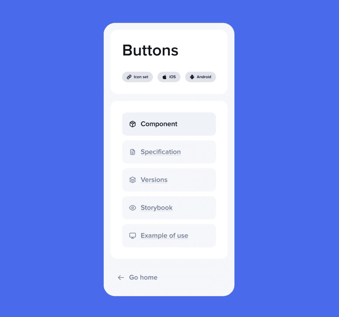
The design system supports components for iOS, Android, and Web.
👨🏾💻👩💻 Team
Nikita Frolov, Senior UX/UI Designer — The most frequent designer involved in the creation of the design system.
Natalia Ivanova, Product Manager — Provided regular updates to stakeholders, ensuring they were aware of the system's successes, which made gaining their buy-in easier.
Andrew Starostin, Lead Developer — His and the developers' contributions were crucial to the system's success.
Yana Panteleeva, Researcher — Tested components within interfaces during overall user story testing.
Natalia Tarasova, Lead/Senior Product Designer (me)
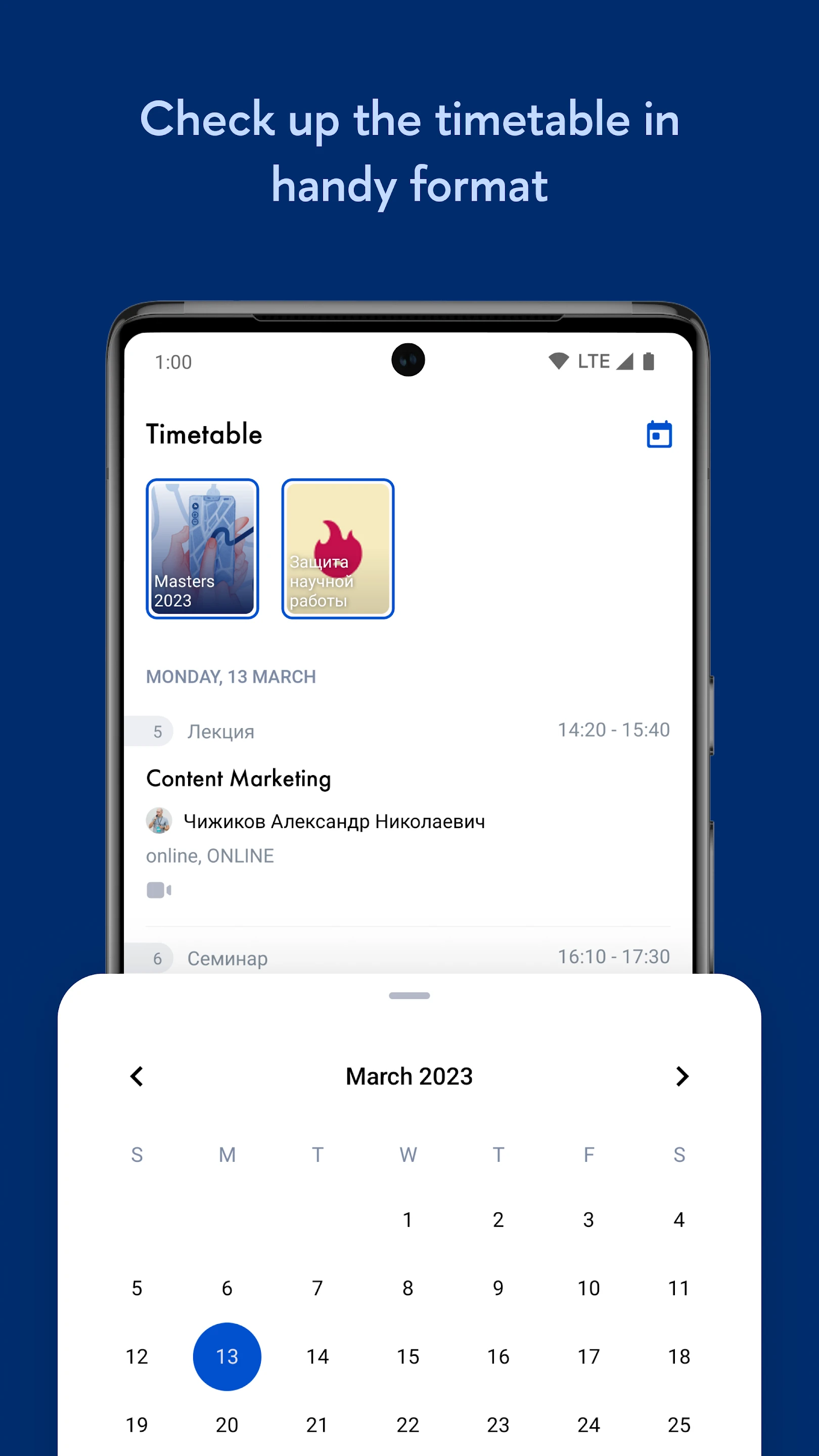
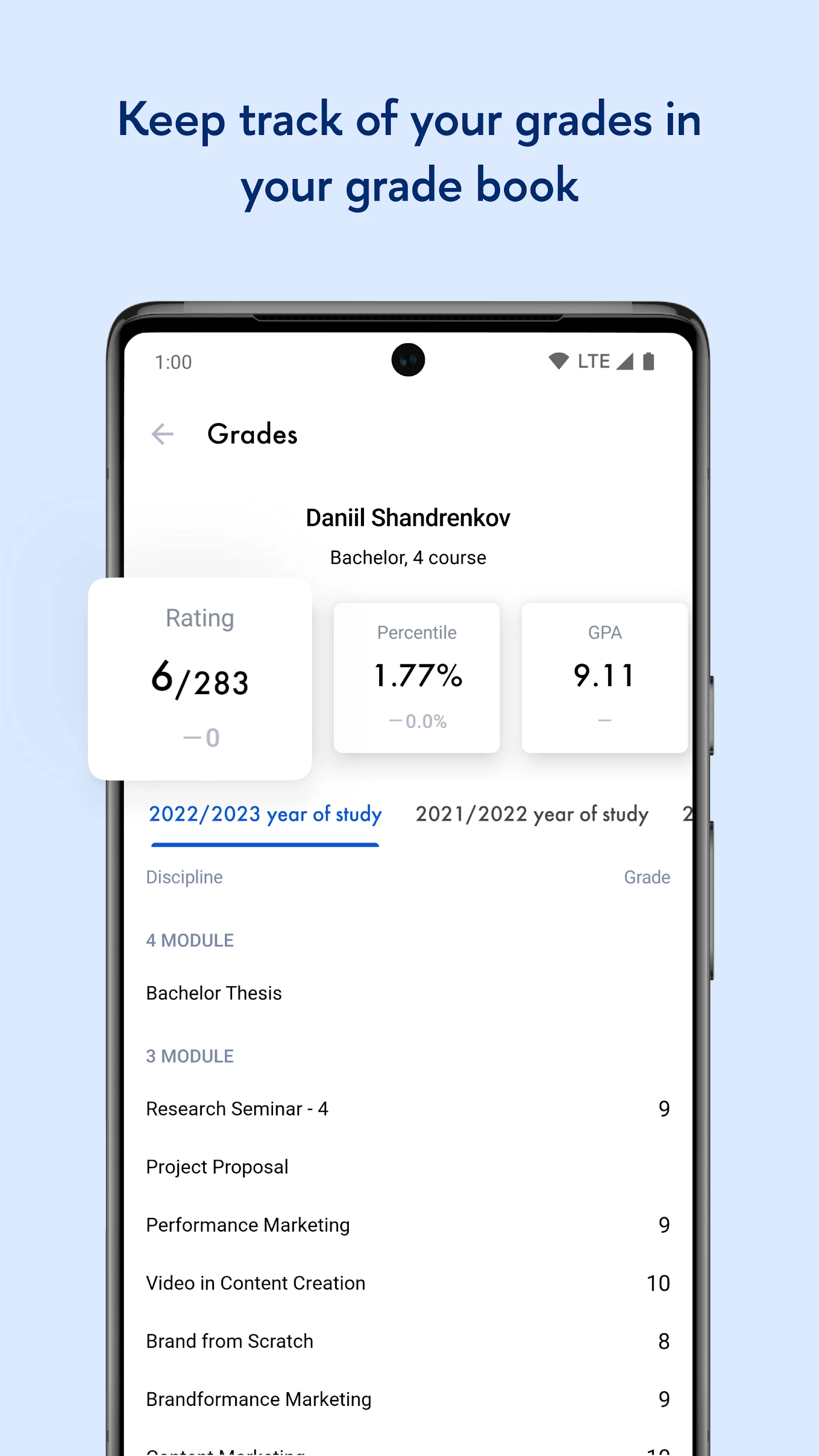
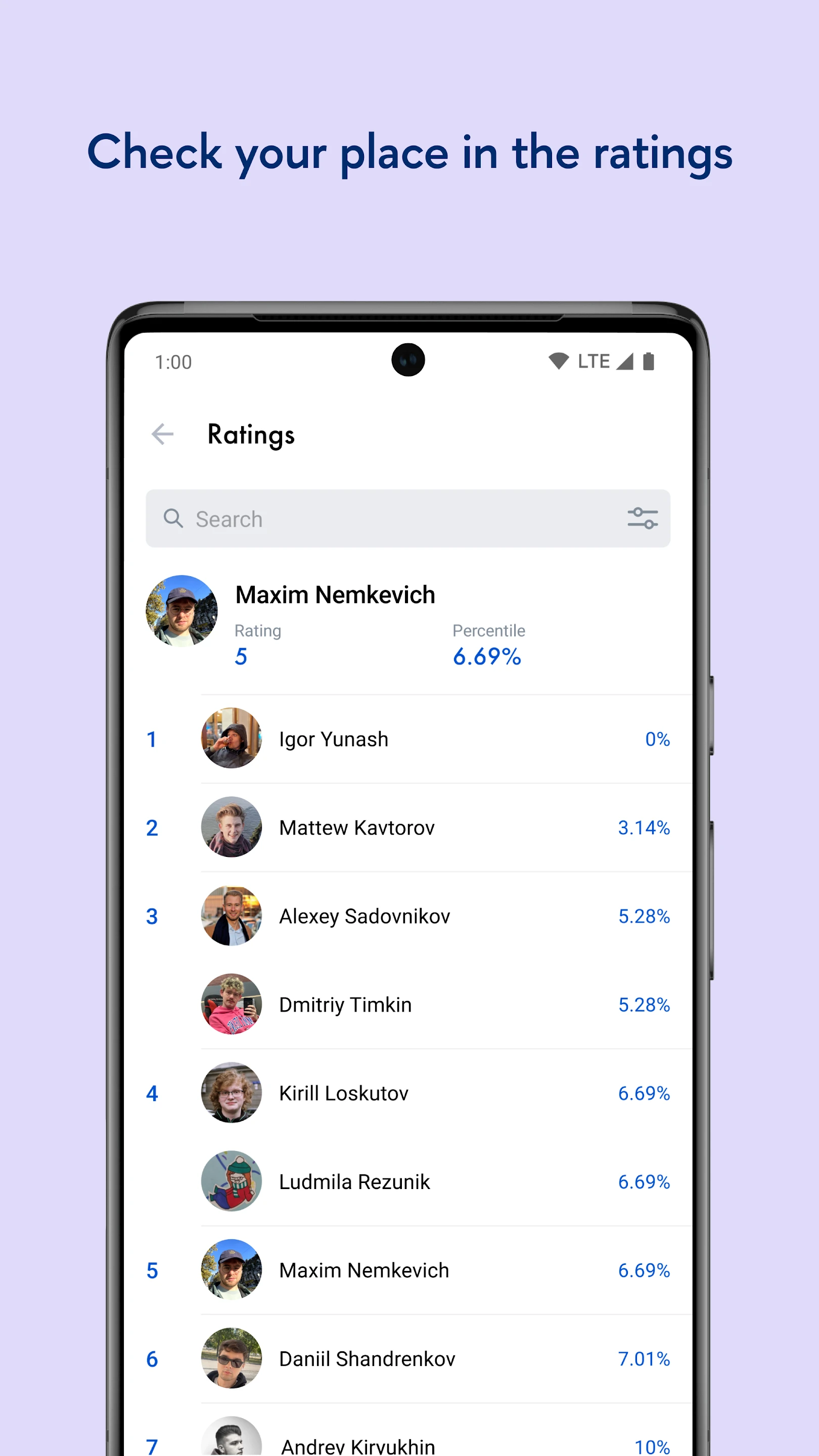
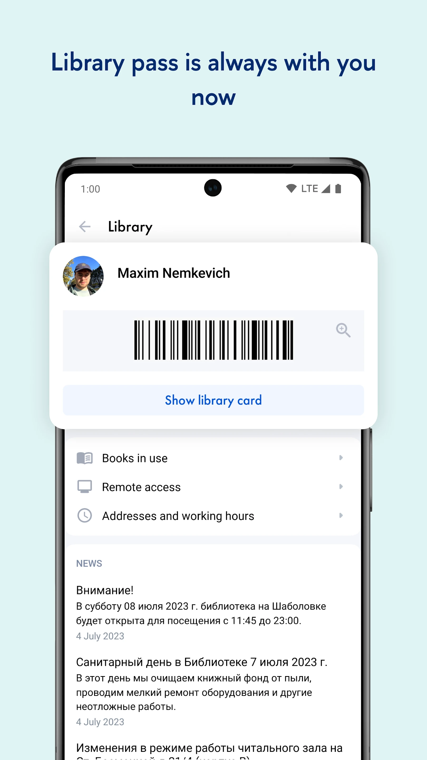
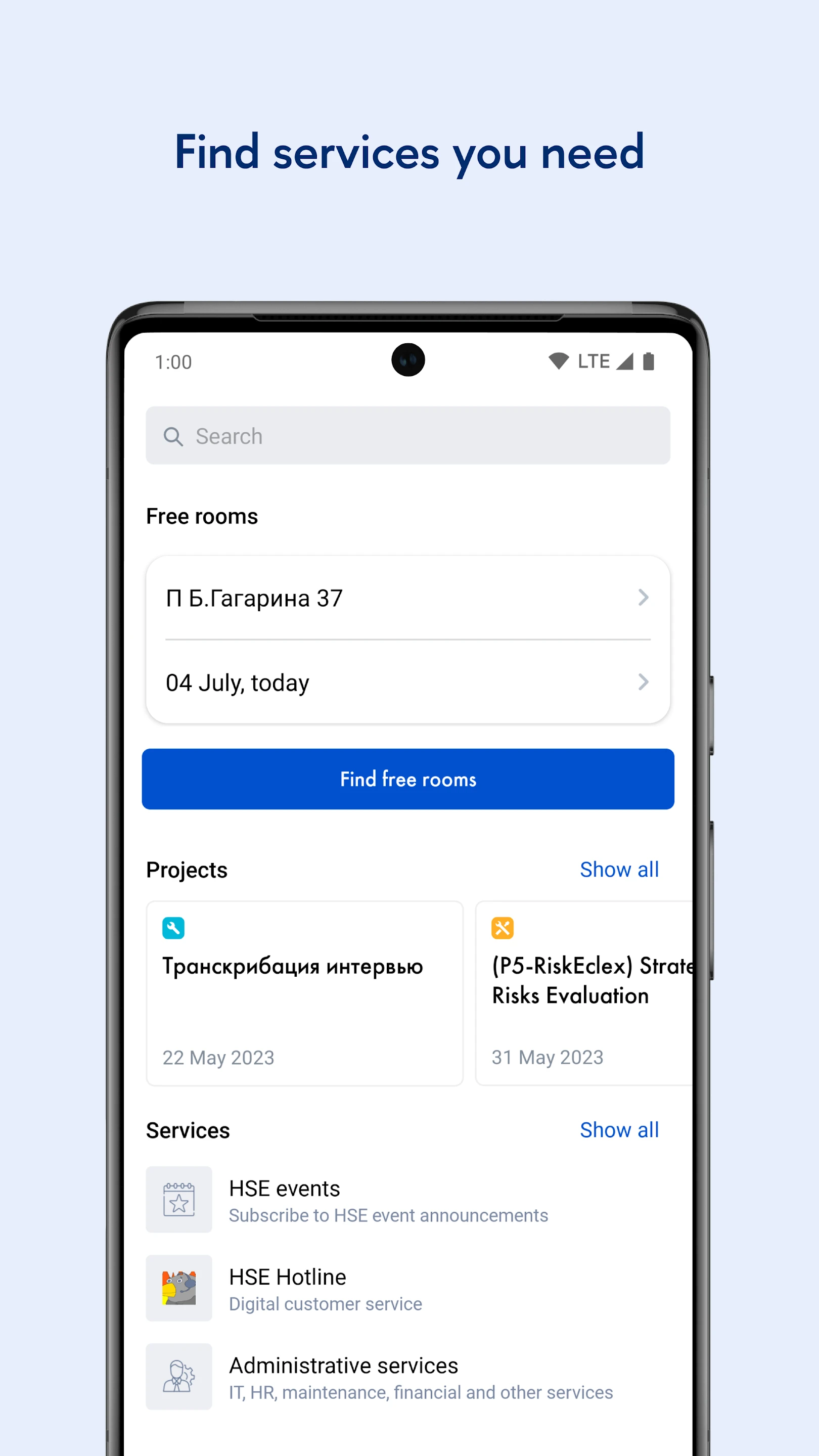
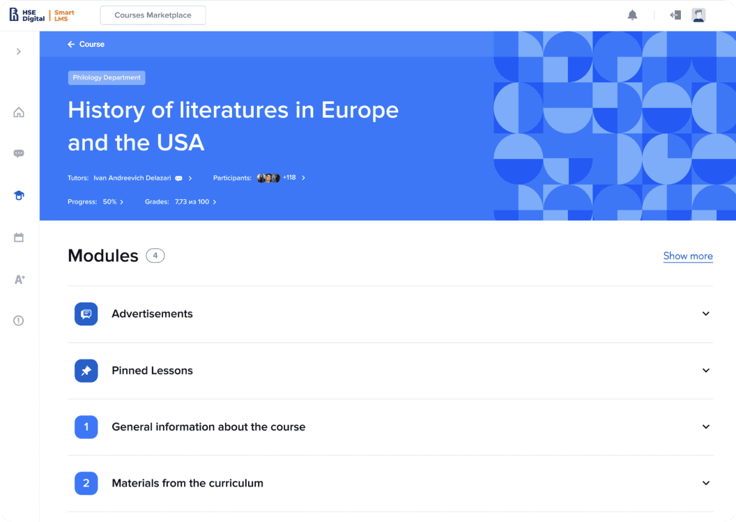
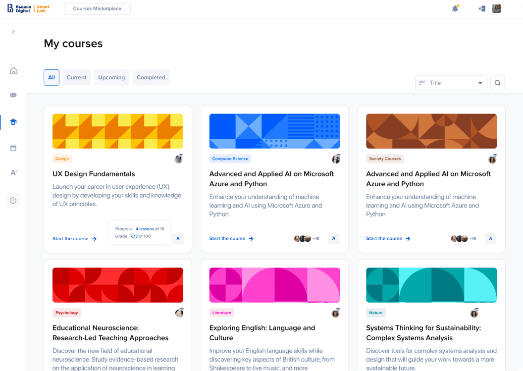
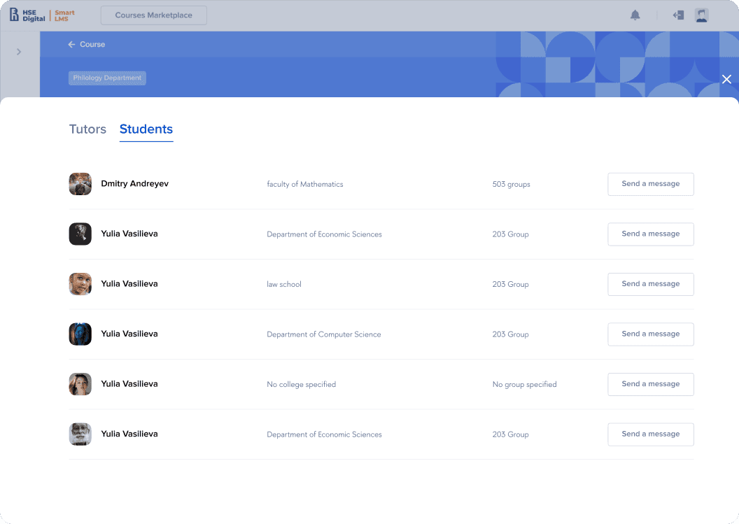
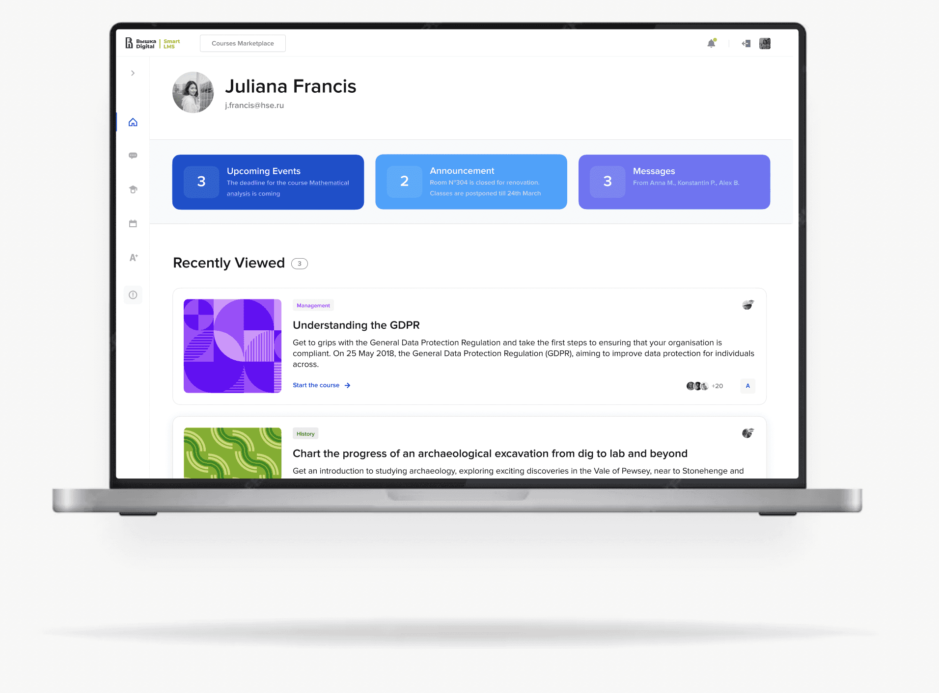
HSE Design System is a multi-brand design system serving 15 brands
Digital – the main digital platform at HSE for managing all aspects of digitalization.
SmartBoss – a project and task management system for executives.
SmartData – a platform for working with big data and analytics.
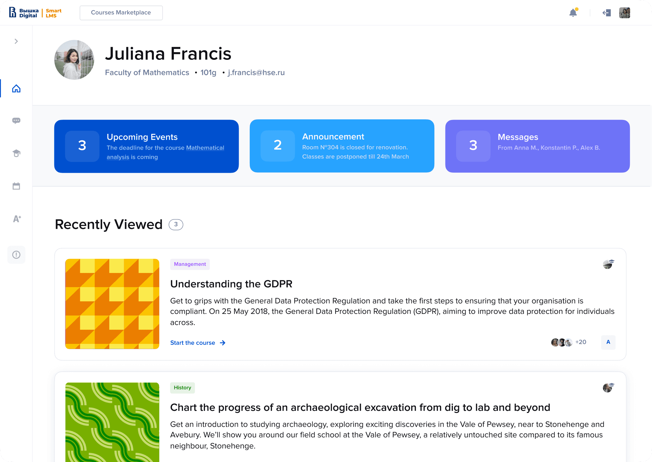
SmartLms – a Learning Management System (LMS).
SmartOffice – a digital space for administrative tasks and office processes.
SmartPoint – an entry point for accessing data and services.
SmartSecurity – a system for ensuring information security.
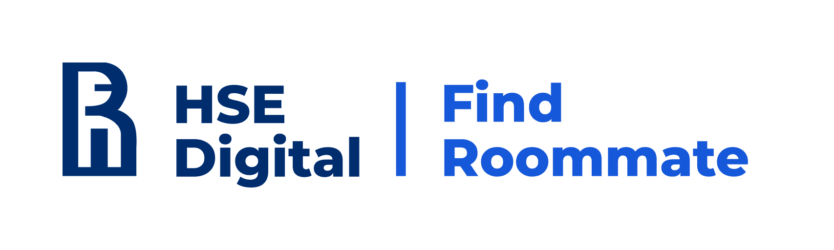
FindRoommate – a service for finding roommates.
HSE Career – a platform for job placement and career consulting.
SmartDoc – a document management system.
DigitalCRM – a platform for managing customer relationships.
SmartAssistant – a virtual assistant for staff and students.
Design System – a design system for unifying digital products.
SmartScience – a platform for scientific research.
SmartReg – a system for course and event registration.

Discovery
📜 Context of problem
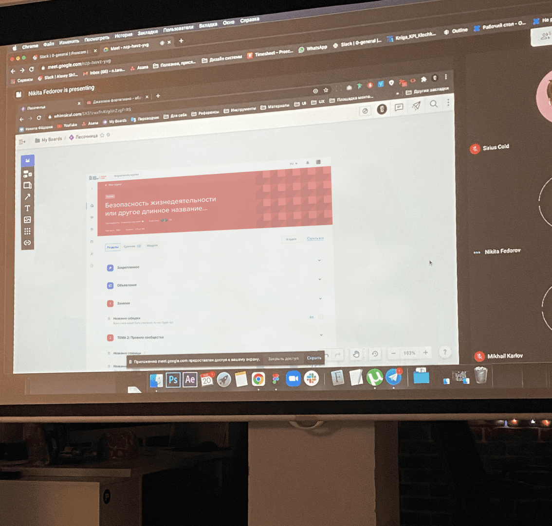
HSE has seen a rapid growth in digital products. The number of development teams and designers increased, leading to issues with design consistency and the speed of releasing new features. The inconsistent and fragmented user experience was largely due to the fact that students were creating designs during their studies.
Each designer contributed to the design system with their own technical approach, considering the visual language of their product rather than the entire brand.
🔍 What I observed after the initial audit
1) Different teams used their own UI-kits
Which caused confusion for users when navigating between sections of the platform.
2) There was a tight schedule for releasing new products and features
Which meant that implementing the design system as early as possible was essential and beneficial for the process.
3) The design teams understood the need for the design system, but were hesitant to fully embrace it
Designers saw the design system as a limitation to their learning experience and were not open to collaboration.
Definition
🟥 Business and user problems
For business
Challenges in scaling the product
Increased development time
Team misalignment
Inefficient update processes
Undermining the university's brand as a leading and innovative institution.
Decrease in the number of applicants.
For users
Inconsistent user experience across digital platforms
Lack of consistency with mobile applications
Complex and unintuitive navigation
Low accessibility for students with special needs
Outdated products appearance
🙈 Students made mocking videos on YouTube, which significantly lowered the motivation of other students to apply to HSE. This case openly highlights student dissatisfaction and the damage to the university.
⛔ Additional challenges
The management and business stakeholders were hesitant to allocate significant time and resources to the development of the design system. They were unsure if these investments would pay off in the near future and expected that my management and training of the designers would be sufficient.
"We need to digitize all processes and unify existing products within 6-12 months"
@Rector of HSE (Nikita Anisimov)
🤝 What we agreed with the stakeholders
1) We agreed that I would create the design system personally and could enlist additional help from product designers.
2) The initial version of the design system would be developed only for the web to measure success metrics. If successful, we would then proceed to adapt it for mobile solutions.
3) My work were tracked using a time-tracking as well as the contributions of other team members, which showed how the budget was being utilized.
Despite the strictness of this approach, it proved to be an excellent way for me to align costs with benefits and provided a strong incentive to prioritize solutions for maximum return.
Strategy
🗓️ First large workshop to define strategy
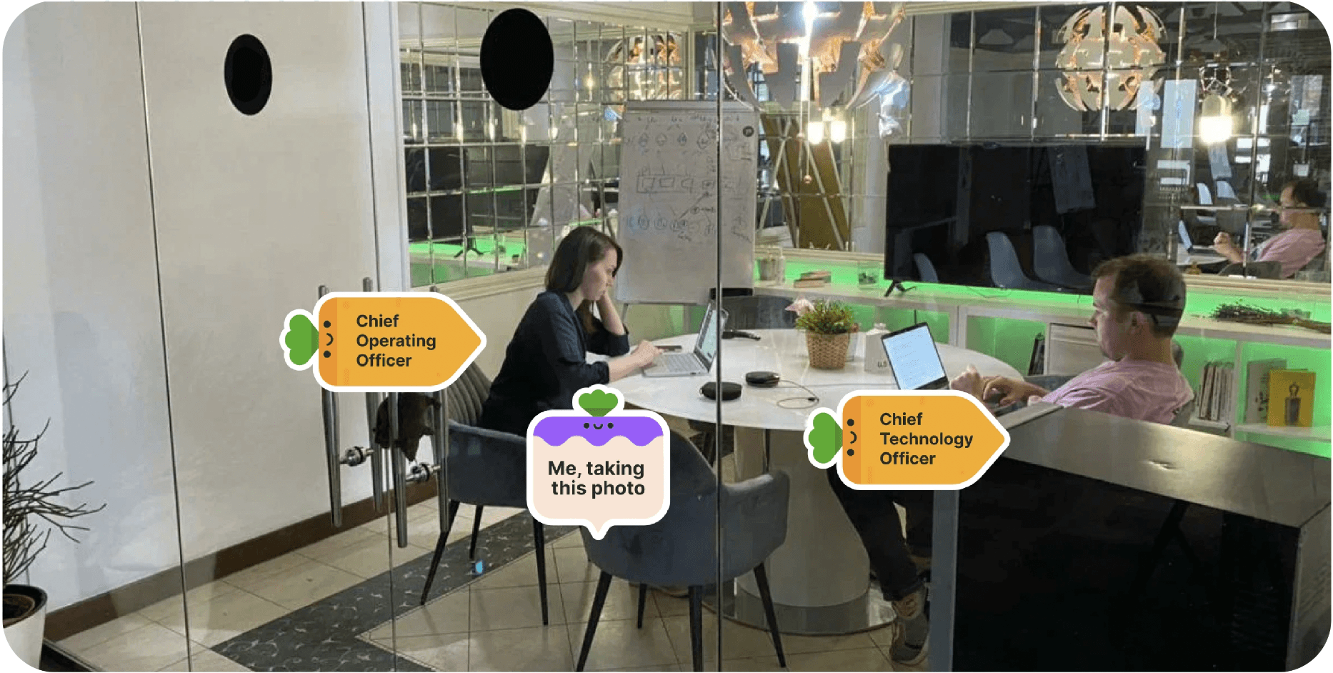
Having understood the business opportunities and limitations, we conducted a workshop with the COO and CTO to define the product release strategy.
My role in this process was to provide realistic estimates of the design development efforts, as well as to explore the possibility of reusing design system components from one product to the subsequent ones.
We also evaluated the products using the RICE method, where I assessed the Effort and Confidents from the perspective of product development for each product.

0️⃣ Initial metrics
Before initiating the changes, I recorded the Usage Metrics
Average time to release an MVP
(design + development) about 4-6 months
Component reuse
around 5% in design and 25% in code.
Students' engagement
with the products was about 15%. Primarily, they preferred to interact with teachers via email and with fellow students via Telegram.
Design consistency score
85% across web and mobile platforms.
Number of error in navigation
30% of students reported difficulties with navigation and stated they couldn't find the necessary information.
Goal achievement rate
was less than 50%. During interviews, students took 4-10 minutes to find the section for submitting assignments.
Net Promoter Score
3.5 from 10 points.
Process
1️⃣ My first action — to establish processes
To create the design system, we needed well-coordinated teamwork, so I:
established channels for open communication (Telegram and Slack)
integrated a stand-up bot, which significantly saved synchronization time
implemented grooming, task breakdown into sprints, and regular syncs with developers
organized meetings to collect feedback from designers
established a process for requesting new components, as well as guidelines for creating unique components
scheduled presentation meetings to demonstrate the results of the design system
conducted training sessions on how to use the design system
implemented audits of completed solutions to ensure compliance with the design system
2️⃣ Gradual implementation
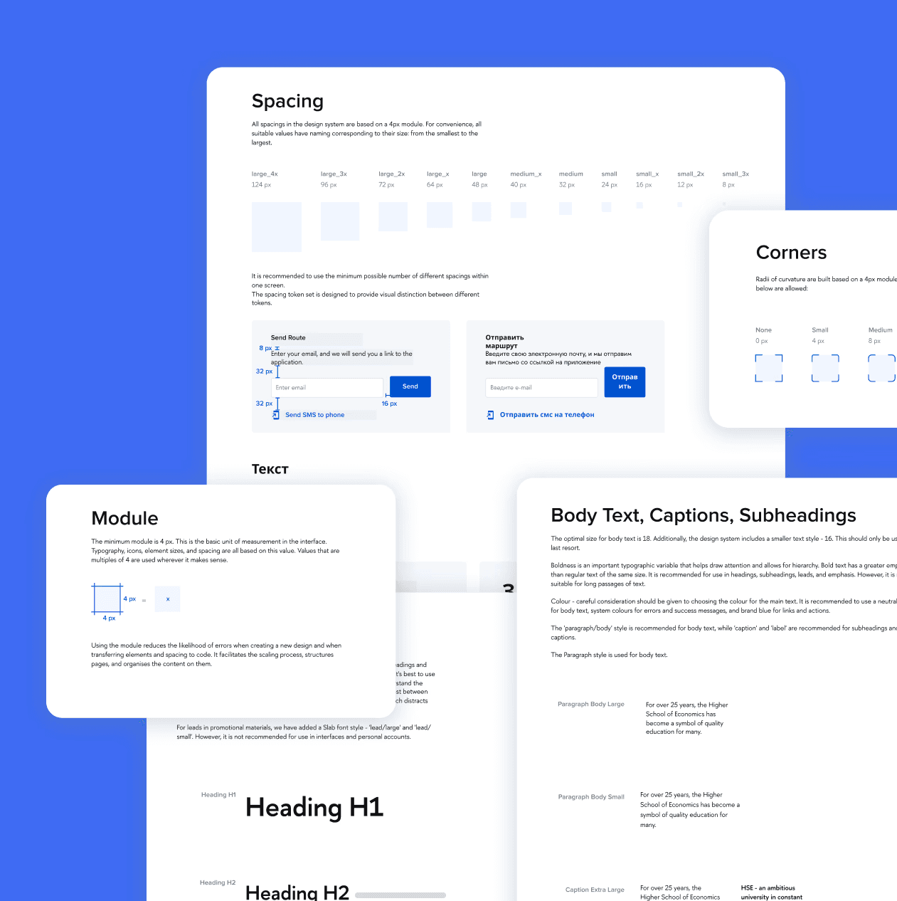
To start, I updated the basic tokens, which helped refresh the look of the products and make them slightly more modern. This allowed stakeholders to see quick results, build anticipation within the design teams, and simply create a good first impression.

3️⃣ Unify products into one style
To create a seamless transition from one product to another, it was necessary to unify not only the tokens but also the components so that their behavior would be predictable and convenient across all products.
Therefore, I proceeded as follows..
1
Asked developers to extract the frequency of component usage and passed my audit

2
Applied the atomic design principle and created basic and common components

3
Tested the components in the interface with a UX researcher
4
Presented the navigation panel for every component
5
Constantly improved components based on usability testing
6
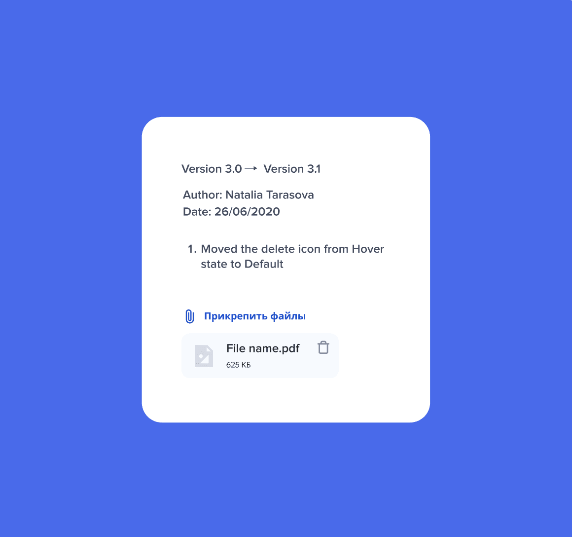
Documented the development of the design system
To ensure the design system was created on time, I made the strategic decision to divide the design teams into cohorts and appoint a lead designer for each cohort.
This approach was essential for efficiently disseminating information to the student designers. Instead of training all 30 designers myself, I focused on educating 3 lead designers, who each then trained 10 designers in their cohort. This not only sped up the knowledge transfer process but also ensured that the quality and consistency of the information remained high.
Designers were empowered to create components based on the guidelines I had written. These components were validated by the cohort leads and then placed in a Figma sandbox where they awaited my final approval before being moved to the shared component library. This process ensured consistency and quality across the design system while allowing for efficient collaboration and component development.

Challenges
Since the design system is cross-platform, the initial challenge was managing projects across different platforms using a single design system. Additionally, questions arose regarding the semantic usage of typography tokens. For example, large headings used in web projects were not utilized in mobile versions, and the mobile versions themselves varied in fonts.

To address this issue, I developed a system that maintains a core font library with base values. Each product accesses the necessary text values as variables, creates text styles that align with the project's semantic requirements, and integrates the required variable values accordingly.
The same principle is applied to components that are reused across project files, ensuring consistency and efficiency in the design process.
In addition to dividing the team into cohorts, I accelerated the information exchange process. Instead of the traditional stand-up calls, I implemented a Slack bot that I had previously developed at Proscom. This bot reduced the number of calls from 5 to 2 per week, while maintaining the team’s productivity and keeping both the leads and myself informed about the progress.
The two weekly calls became much more efficient since we were already in the loop. We focused on synchronizing efforts or planning, rather than discussing what had been done and what was blocking progress. As a result, the duration of the calls was reduced from 1 hour to just 20 minutes.
The new component designs were seamlessly integrated into the code, making the first step toward adopting the design system.
What also helped significantly was:
A process for submitting new component requests through Asana.
Presenting the new changes to the design system through a recorded meeting with pleasant music and a narrative explanation.
Conducting workshops to tackle complex, non-trivial tasks.
Training on how to use the design system and create new components.
Auditing the created solutions for alignment with the design system, along with providing personal WOW approval.
After we gathered data on the success of the design system for the web platform, I gained stakeholder support to continue the work and set my focus on unifying the existing products on iOS and Android into a seamless user experience.
Since iOS and Android platforms have differences, I chose the following strategy:
Aim to select component behaviors that are universal for both platforms.
Lean more towards the visual language of iOS components rather than Android.
Ensure that transitioning from one platform to another does not force users to relearn the interface.
Simplify and create expected behavior of elements, regardless of the platform.
9️⃣ Prioritization of component development
generating the most revenue, required the component
how often the component was or could be reused
whether it was possible to create the component based on an existing one
simplicity and speed of its development
🔟 Interaction with stakeholders

1️⃣1️⃣ Evaluation of process performance
Consistency of interfaces: I evaluated the number of unique UI components used across different parts of the system and the frequency of their reuse.
Errors and revisions after releases: A key metric was the number of fixes and rollbacks after releases. I tracked the frequency of errors related to design flaws and the integration of UI components into the code.
Cognitive load on users: Through usability testing, researcher and me measured the time it took users (students and administrators) to complete standard tasks on the platform. This metric helped us assess how a heterogeneous design complicated the user experience and interface usability.
Adoption rate of the design system by teams: I monitored how actively teams used the design system and how many new components were reused during its usage. It was important to understand how much the system facilitated the teams' work and whether it helped them achieve their goals more efficiently.
1️⃣2️⃣ Iterative testing
The test phase was crucial for the successful implementation and long-term sustainability of the design system, so a led:
functional testing to ensure that each component functions as intended across various scenarios and use cases.
accessibility testing to ensure all components meet accessibility standards (like WCAG) to create inclusive designs.
usability testing to ensure components are easy to understand and implement.
feedback loop. I established a feedback mechanism to continuously gather input from users of the design system.
Results
🎯 Final value for users
Students now experience seamless transitions between products. Navigation works consistently and predictably across all platforms. Mobile interfaces inherit the structure of desktop ones, allowing students to intuitively transfer their expectations from desktop to mobile solutions.
For example, the academic service that students use throughout their studies maintains a consistent structure. Upon graduation, they transition to the career development service, which adopts similar design patterns from the previous product. Likewise, the mobile app replicates the functionality of the academic service.

🎯 For students with physical limitation
Solutions were implemented that include voice assistance and the option to enlarge components and text by 1x and 3x.
Additionally, a dark mode was introduced, providing a more comfortable learning experience during nighttime.

🎯 Final value for business
Accelerated the development of new features and products.
Increased satisfaction among students, teachers, and staff.
Students became more engaged with educational products, where they could easily interact with instructors and carry out the learning process.
The design system indirectly contributed to the overall satisfaction with HSE products and its NPS.
New products received numerous awards and, thanks to marketing efforts, were promoted across the internet, indirectly helping the best students choose HSE.
Additionally:
An end-to-end process for design system development was established.
Chatbots were created to speed up synchronization.
Developer turnover decreased as their overall satisfaction increased.
Design teams improved their skills, positively impacting the employment rates of students.
🎯 KPI achived
Development speed increased by 200%.
Before: Average feature development time = 6 weeks.
After: Average feature development time = 2 weeks.
Component reusability rate
70% of UI components are reused across all projects, compared to 5% (design) and 25% (code) before.
50% reduction in maintenance time
Before: 200 hours per month.
After: 100 hours per month.
Students' engagement
with the products was about 75%.
Number of error in navigation
reduced to 3%.
Goal achievement rate
92%. During interviews, it took students 1-2 minutes to achieve their goal.
Onboarding time
No more than 1 week.
Net Promoter Score
8.5 from 10 points.
🎯 Final value for 15 sub-brands
The sub-brands were given flexibility in using their unique brand colors. For each sub-brand, I also provided a color palette that allowed them to meet their advertising needs while maintaining a connection to the overall university brand.
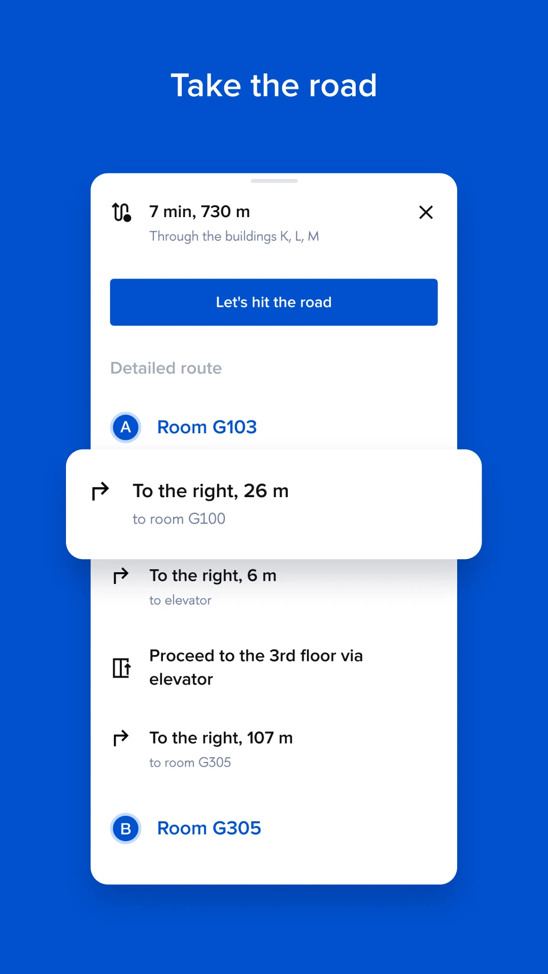
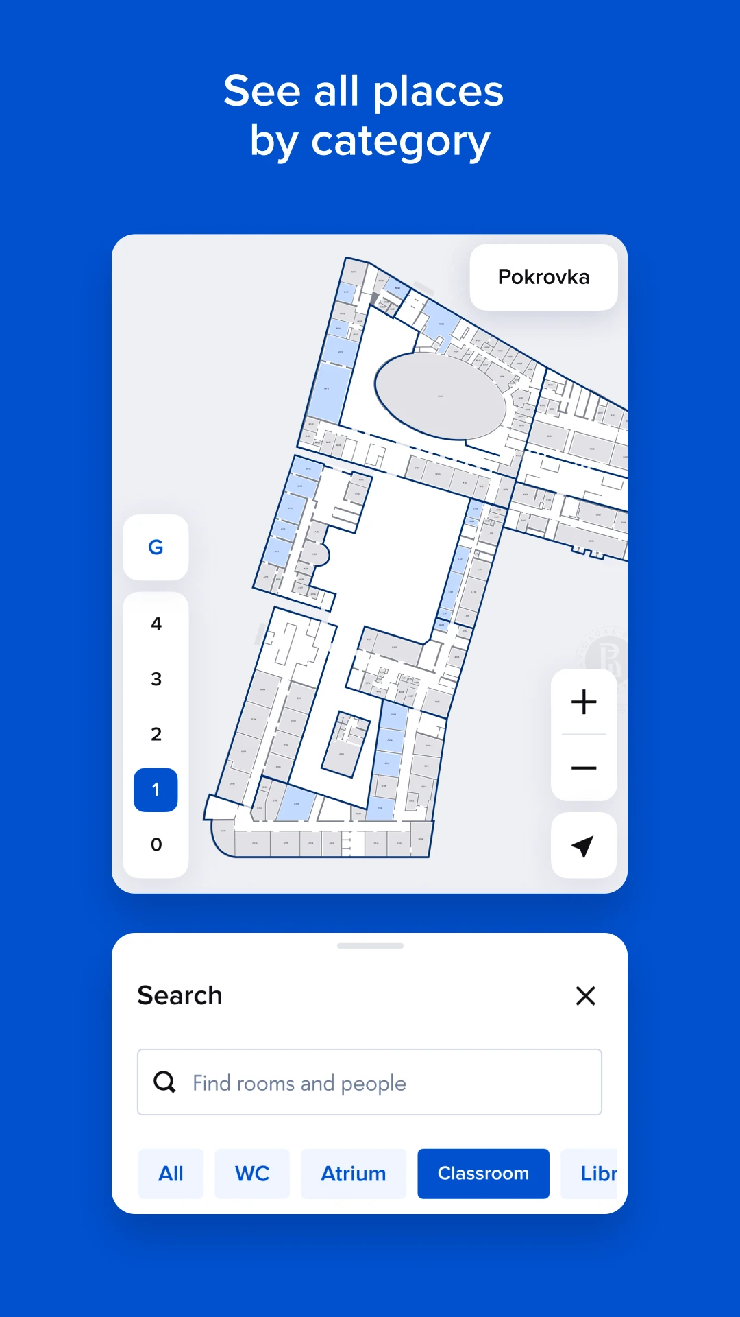
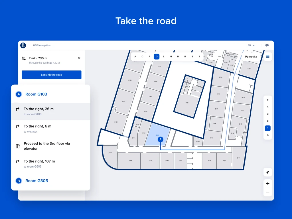
HSE Havigation
Download from:


HSE App X
Download from:


Download from:


And many other products..
💡 Lessons I learnt
1️⃣ Since some of the products for HSE were still being developed by Proscom, and others by HSE teams, our Slack channels didn’t align, so I created a chat in Telegram where anyone could ask questions.
Over time, I started noticing that I didn’t always understand the role of the person asking the question, which significantly affected my response time and understanding of the context. A manager advised me to keep a table of usernames and roles, which I did, and it really helped!
2️⃣ When designers started using the design system, they didn’t know that icons could be colored. This helped me quickly realize that:
Sometimes people are afraid to ask questions for fear of seeming unknowledgeable.
Documentation is needed not only for developers but also for designers.
I should be the first to take the initiative, otherwise people may not realize they can come to me with any questions :)
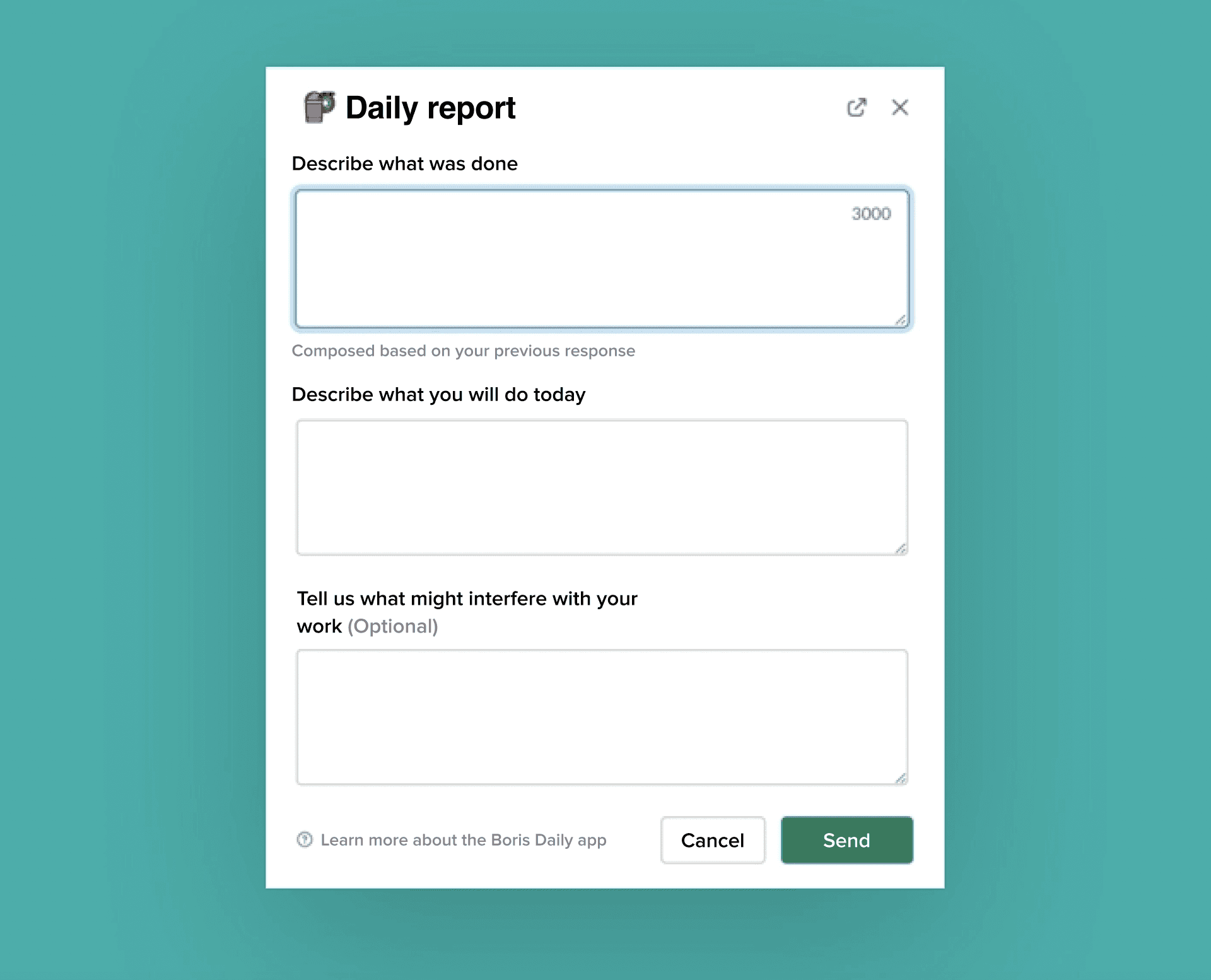
3️⃣ Not only Slack bot helped designers feel heard, but also stakeholders could see the number of requests and the demand for the design system team.
The Slack bot, called Bot Boris, is one of my initiatives for process optimization at Proscom, which helped save up to $140,000.
You can read more about it via this link, though it's in Russian, but with Google Translate it's still interesting to read: https://finacademy.net/materials/article/avtomatizaciya-biznes-processov.
Leading achieving a 20% Rise in User Adoption, 15% Increase in Course Completion, and 25% Growth in Student and Faculty Satisfaction Within a Year
Case study