Home
Return and retention users in LMS
👩🏼💻 My role

Natalia Tarasova – Lead designer
Mikhail Karlov — Senior designer
Daniil Voronov — UX/UI designer
Maria Zakharkina — Product manager
Nikita Varlamov — Lead developer
The business problem
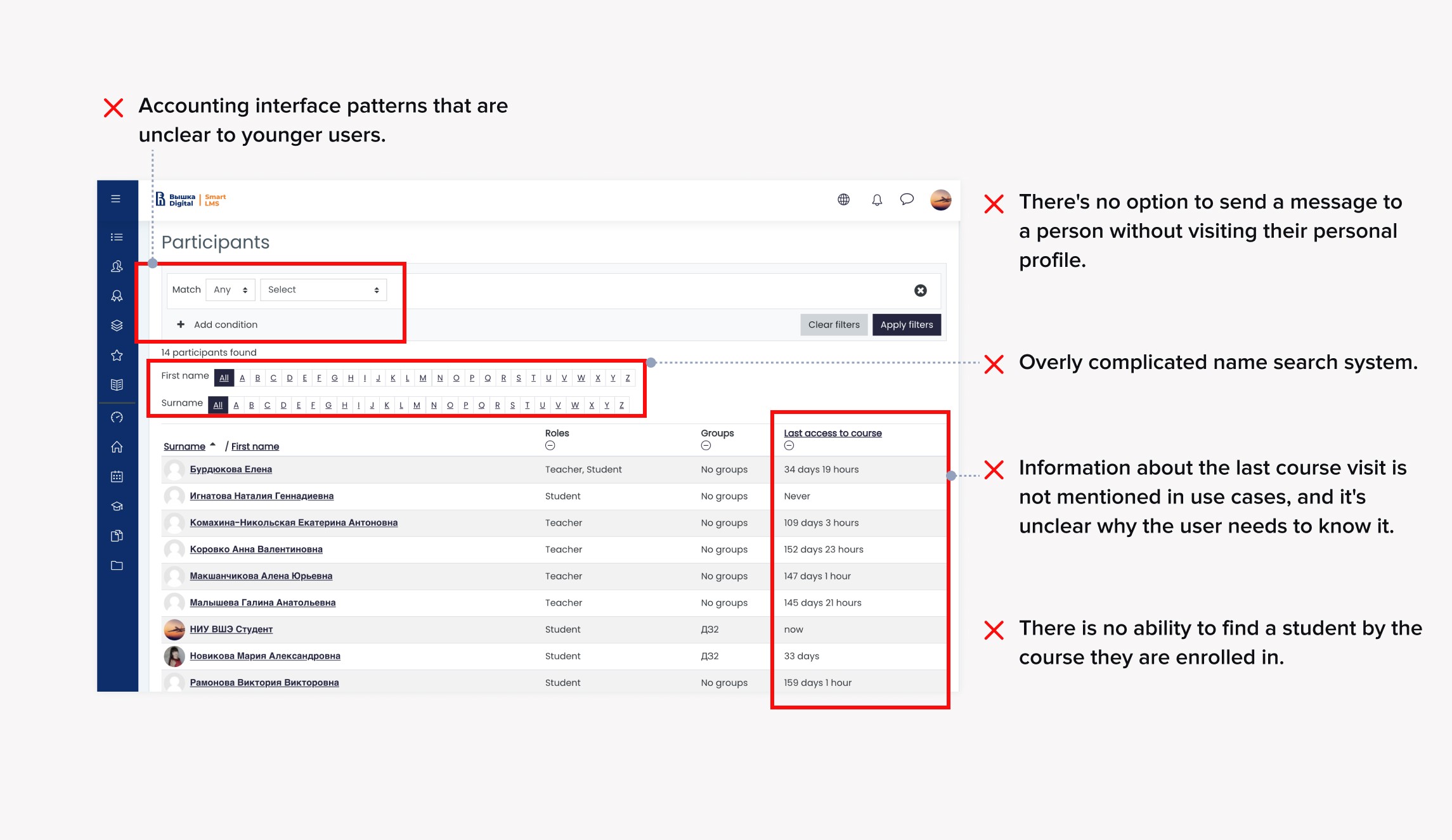
⛔️ The user experience suffered due to the product's confusing behavior, and outdated interface patterns made it less user-friendly.
⛔️ All product metrics showed a decline based on analytics and UX research findings.
⛔️ The business aimed to enhance the university's brand to establish itself as a leading technological institution and align with the marketing strategy, ultimately attracting more students.
⛔️ UX research revealed that young users no longer found our product stylish or visually appealing.


Original product
🎯 Goal
I was tasked with bringing back students to the system, engaging and retaining them, and to achieve this, I had to perform a complete redesign of the LMS.
🌟 Redesign of core features
Before getting into my design process, here's a direct comparison of the redesign

How it happened..
Discovery
What makes students avoid LMS? 🤔
Poor user experience with no need to use it👇🏻

Research
What are needs and problems?
The UX researcher and I scheduled a series of interview sessions, during which we identified the specific Jobs to be Done (JTBD) that our product should be 'hired' for. I've recorded the needs that drive users' behavior.

Research
The inconvenience of using LMS made designers create themed chats on Telegram. I studied the topics and identified the main 3 groups:
Educational announcements.
Social events outside of classes but within the university.
Chat rooms for group conversations.
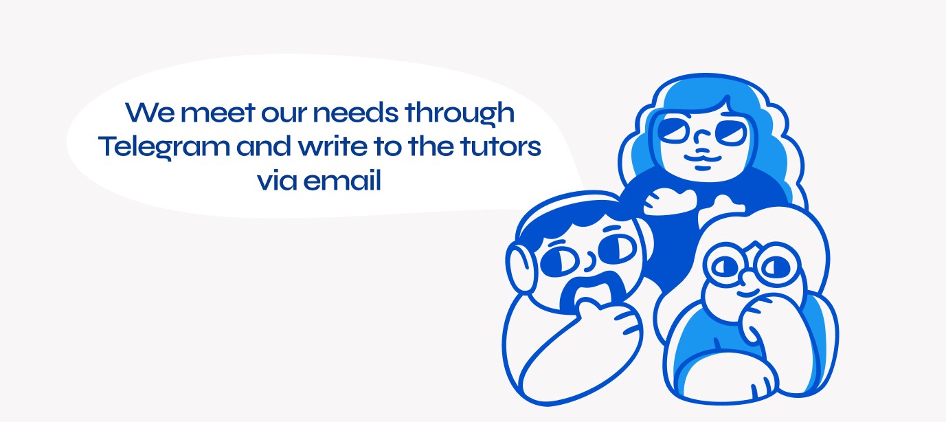
All this led to various problems for users, but the students got used to the inconvenience. We needed to create a solution that would make the students' lives so much better that they would stop using other products.
Definition
It wasn't a traditional design sprint as described in the book because I suggested brainstorming for each 'How Might We' (HMW). I wanted to immerse the team in the entire product, not just each task individually. Additionally, developers provided insights into the capabilities and limitations of the Moodle system, on which the entire LMS was built. This helped designers understand what could be technically easy to do and what couldn't.
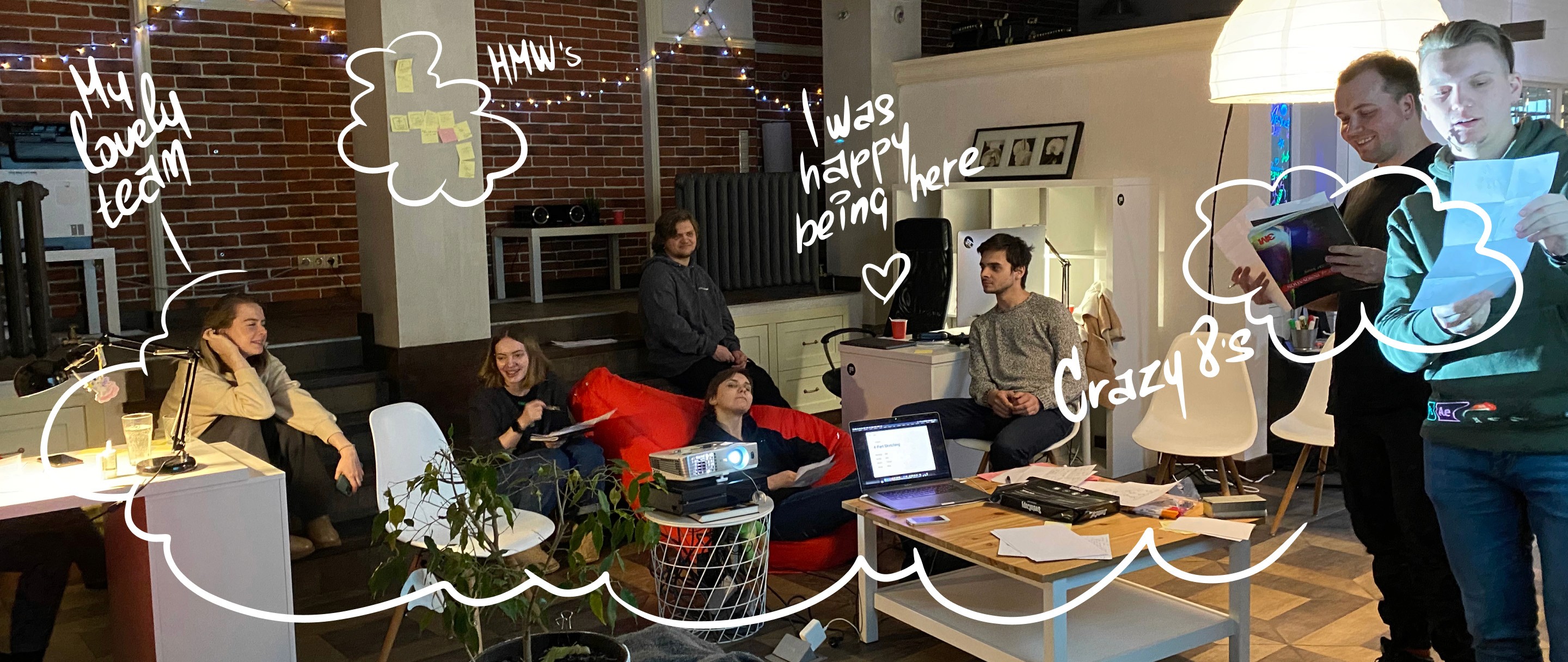
3 designers, 1 product owner, 1 lead developer, 1 business analyst from the university side, 1 stakeholder.
As a result, we ended up with 8 main 'How Might We' (HMW) questions. For each of these questions, we brainstormed ideas using Crazy 8's and voted for the best ones. The idea that received the most votes was taken into development. If it was a developer's idea, a designer who wanted it could take it. This approach worked well because I had an experienced and motivated team of designers.


Redesign preparation
Structure formulation
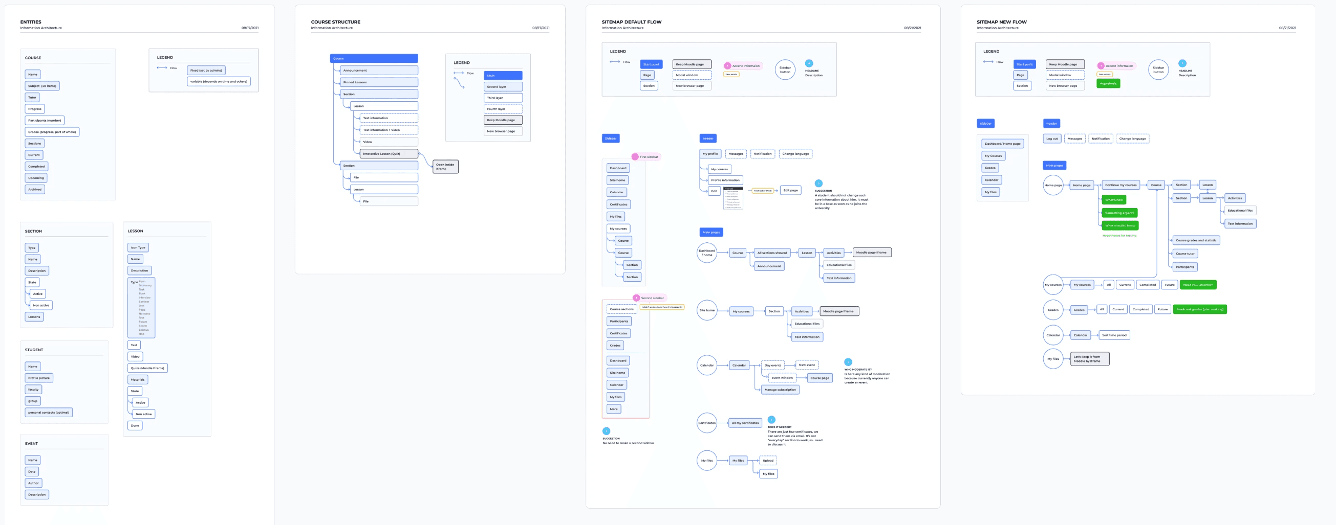
I also reviewed the existing information structure and made significant changes. Many sections were duplicated, and some information was inconsistent. That's why I documented the information structure, as well as the sections and information that aligned with our goals.
Redesign preparation
Stories and scenarios for tasks allocation
To set tasks, I outlined what stories should happen in the section or page that the designer would be working on. This way, I documented the functionality in alignment with the structure to ensure that the product was cohesive and connected different parts.
Redesign preparation
I've reviewed LMS analogs to find different interface pattern ideas. The main source of inspiration was Google Classroom. I chose it because it closely resembled the technical capabilities of Moodle.

Redesign preparation
During the secondary research on students, I developed a hypothesis that students need to receive three types of news that they create in Telegram: announcements from teachers, updates on events, and chat discussions. I decided to test this idea because it has been tried and tested before and is familiar to users.
I've drawn ideas which could meet user stories and chose the best by SWOT method.

Solution
📍 User problem
Students found it difficult to navigate the interface because functions were duplicated without clear distinctions. There was either a lack of necessary information or it was duplicated in multiple places with similar meanings.
📍 Obstacle for business goal
Students are reluctant to use the LMS (Learning Management System). Instead, they are resolving their queries in Telegram or spending time seeking assistance from technical support and teachers to find information.

🌟 Solution
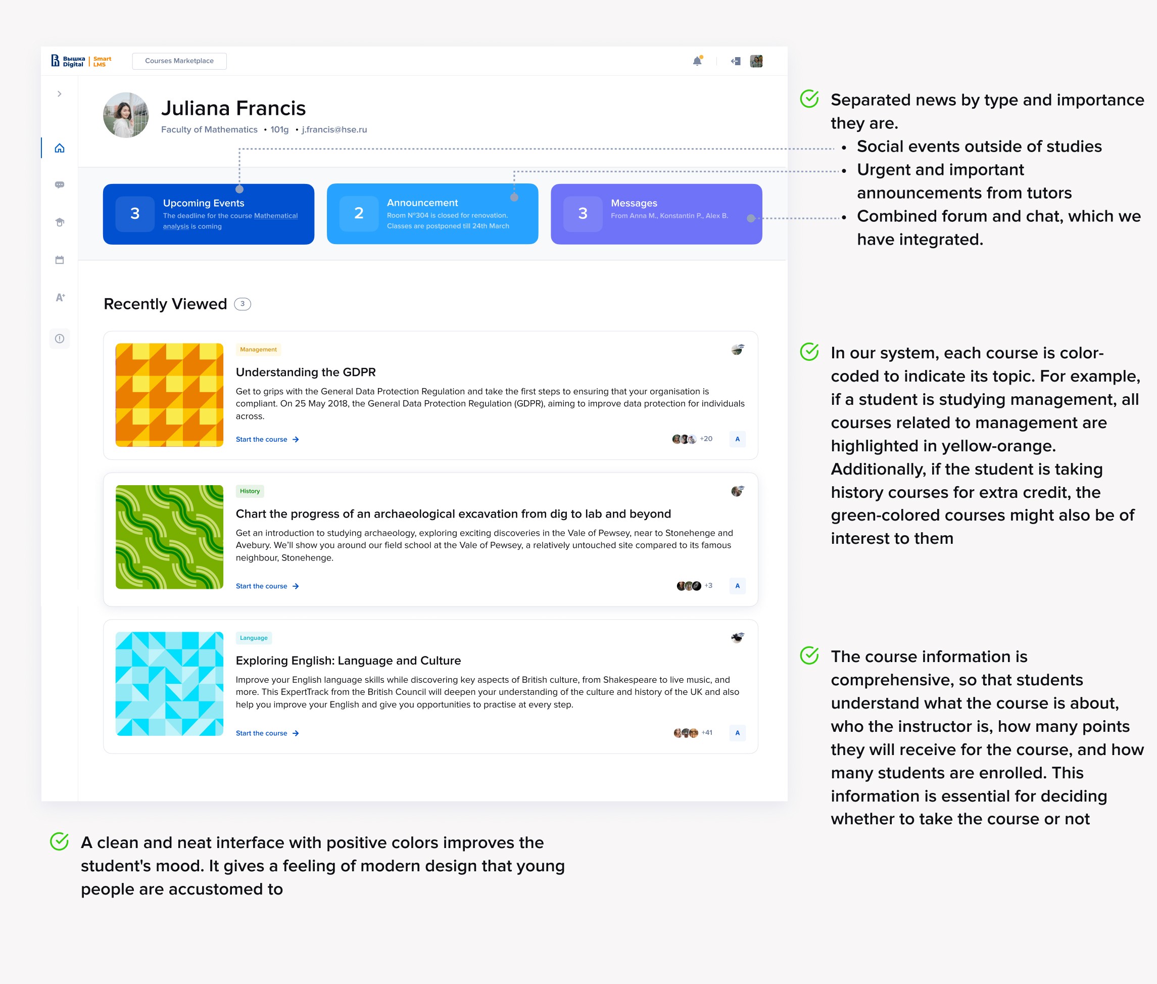
Business Problem: Separate news by types, present them distinctly and pleasingly. Provide comprehensive course information so that the user can make decisions based on it.
📍 User problem
Students find it difficult to adapt to various course design styles. Announcements often go unnoticed, and learners miss important updates. Additionally, research has shown that students find it inconvenient to switch to the grades tab to check their course scores instead of seeing them immediately
📍 Obstacle for business goal
Teachers spent time making courses 'user-friendly.' They decorated them with images to make announcements stand out. Indirectly, student performance suffered due to missed announcements, such as changes in the deadline for research papers. These factors hindered the achievement of business goals.

🌟 Solution
Provide complete information about the course, including progress and academic performance. Organize the information for easy overview and in-depth details. Offer quick access for both teachers and students without interrupting the course activities.

📍 User problem
To discuss course-related questions, students had to exit the course, go to chats, find the course chat, and communicate there. These additional steps were cumbersome for students and disrupted the context of the discussion topics. Additionally, reaching out to the instructor required a separate search outside the course page.
📍 Obstacle for business goal
Moderators used to spend time monitoring the names of newly created forum topics to ensure they complied with the guidelines. Automatically generated chats for communication with students and teachers have eliminated the need for moderator intervention, further reducing labor costs.
🌟 Solution
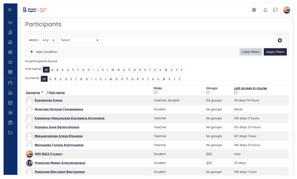
Allowing you to get in touch with students and teachers from the course page. Using a user interface pattern similar to mobile apps or desktop services, like Dribbble, that clearly indicates the connection of the new page to the course page. This way, we visually communicate that 'you are viewing students and teachers of this specific course.

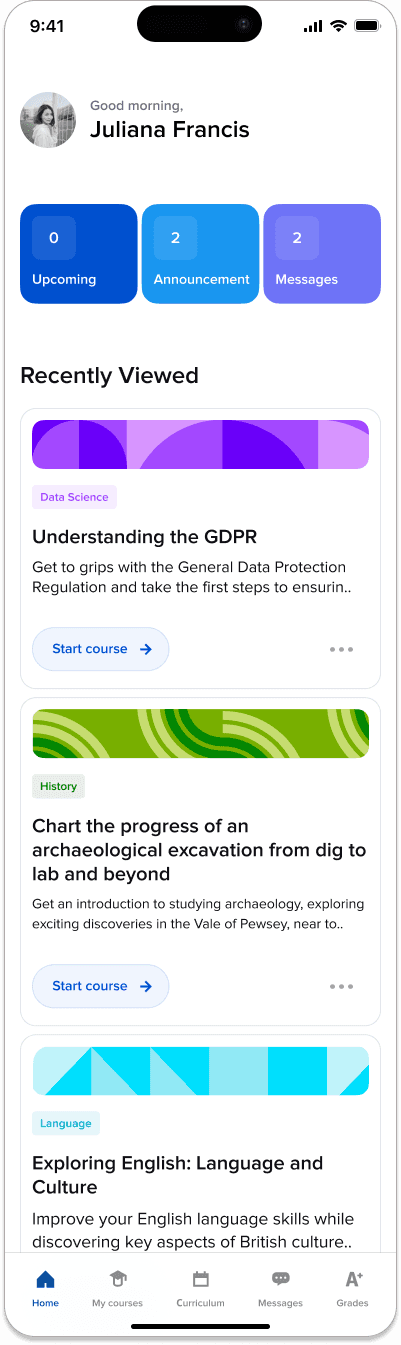
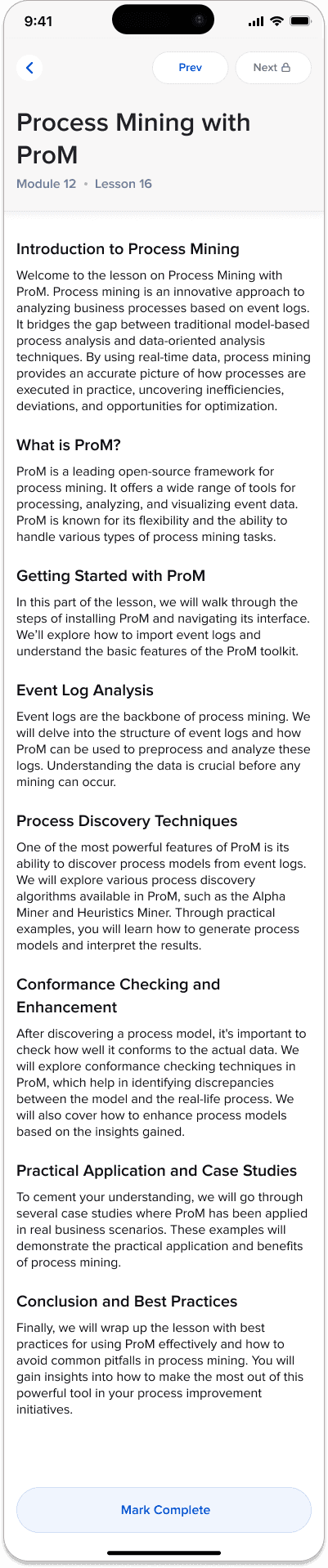
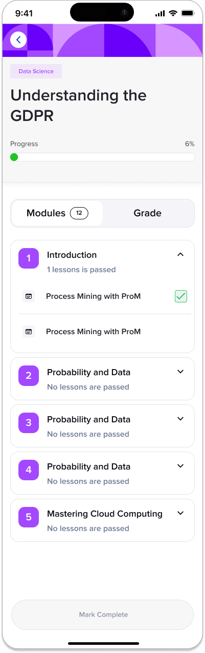
I redesigned the other pages of the main user paths with a focus on making the information more useful, user-friendly, and visually appealing in a modern way.
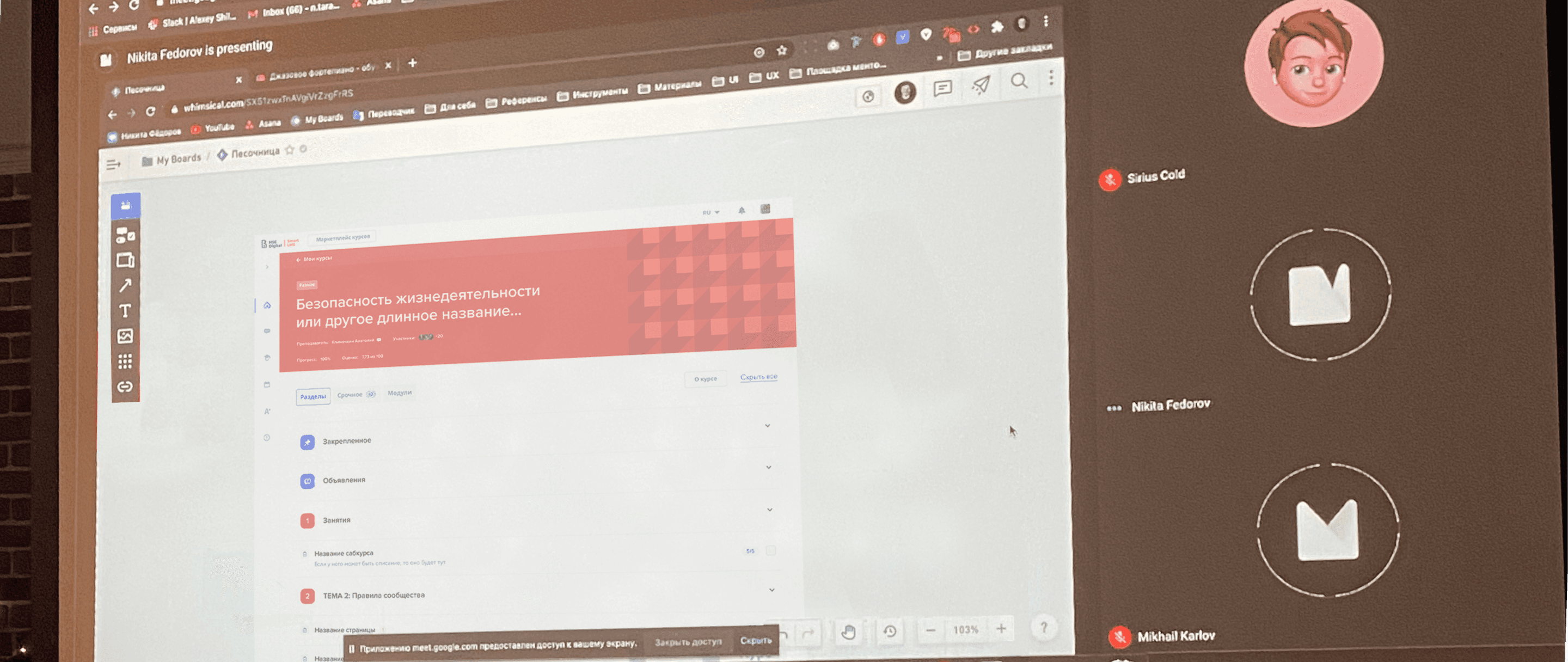
I've developed animated interfaces using Figma and undertook usability studies to comprehend the user engagement with this fresh interface. I executed 40 evaluations across two weeks, engaging with learners who were active on the platform. I coordinated the examinations, crafted tasks in the model, watched users through Zoom screen exposure, and collected their thoughts. The positive resonance I received was merged with spots of enhancement that I discovered, all of which was factored into the finalized design. Witnessing user interaction and their responses was both stimulating and uplifting, fueling my decision to prioritize user-oriented design.

Challenges
I regularly synced up with the team responsible for developing the faculty access. They, in turn, identified a pain point among teachers, which was the difficulty of creating course covers and formatting each time. We also received feedback from students that it was inconvenient to see different styles from various instructors.

At the university, there are over a thousand courses in 34 academic fields. Providing ready-made covers is not practical because it's a lot of work, and it would need to be repeated as new courses are added.
In that case, I talked to the developers to see if they could write a script to automatically generate textures. To my delight, the developers said it could be done quite easily. So, I came up with the following logic for the script.

Next, I asked the illustrator to draw many pieces, and I prepared the original colors that could be used to create color variations myself.

We assign a color or combination of colors to each subject. All courses in the same subject will be colored with these set colors, but they will have different patterns to create a unique course look.
In this project, the biggest challenge for me was merging UX with Moodle's technical capabilities. Due to code limitations, I couldn't implement the solutions that performed best in testing. I had to find compromises and enhance the user experience using the available means.
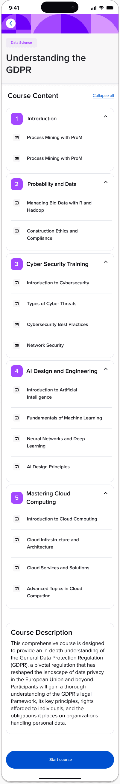
Here's an example of my course page redesign.

I couldn't predict how the product would change in the future because it's built on the Moodle platform. A teacher might want to insert a quiz for which I hadn't done a redesign. I addressed such situations as follows:
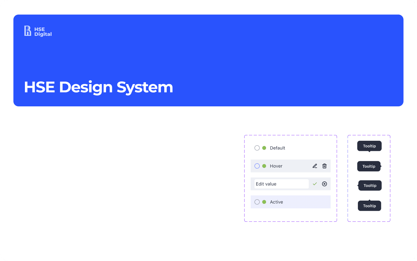
1) I created a design system that provides tokens. Tokens define the visual style of any Moodle page by specifying basic interface elements like colors, shadows, borders, as well as the sidebar and header.

2) For additional unique parts, I designed them separately, considering that a part of Moodle would be inserted via code through an iframe without changes. But with my design, the insertion would look seamless.

Testing session for the final solutions
When assigning tasks, I took on the core pages that had the most significant impact on the user experience. Other parts, such as redesigning the survey process, managing educational materials, and handling exam sessions, I delegated to team members, and they did an excellent job with the tasks.
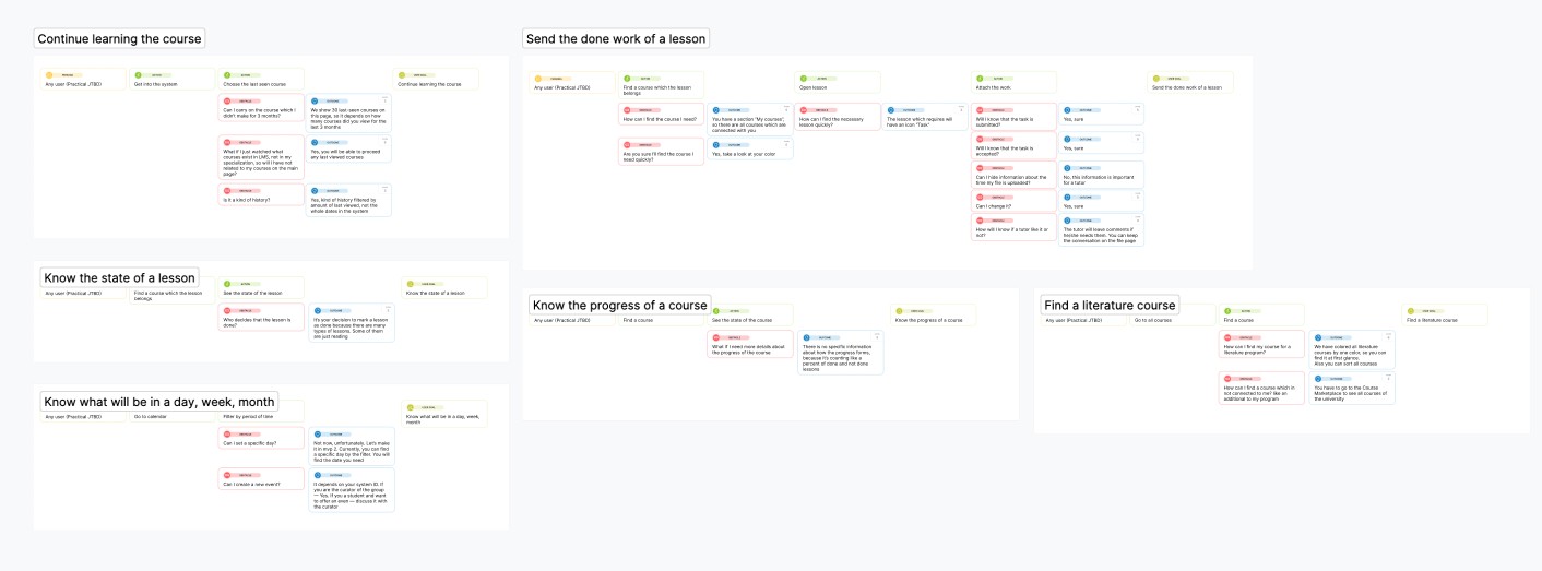
As a result of creating all the screens that enabled us to achieve the set goals, I, together with the team of UX researchers, conducted moderated and unmoderated testing. My goal was to find out if students could:
🤔 easily find and access all types of news updates within the LMS.
🤔 continue learning quickly
🤔 obtaining and submitting educational materials.
🤔 find a tutor or classmate from the specific course
Results
Final solution
This video with screens represents the team and my design efforts. This outcome is a testament to our team's synchronized efforts and effective leadership throughout the project.
🌟 KPIs achieved
After the first three months of using the updated Desktop LMS and LMS App
Course Resumption Rate
User Engagement Metrics
Student NPS score
Process Time Metrics
Mobile synchronization
After updating the desktop version, it was necessary to adapt the mobile application to the new interface patterns of the desktop. So I took next steps..
Research Phase
Although the research stage was already done for a desktop version I've conducted a re-evaluation of the initial desktop research through the lens of mobile usability. Me and UX-researcher focused on understanding how user interactions, needs, and behaviors change when accessing the LMS via a mobile device. This included analyzing data on mobile usage patterns, screen size limitations, touch interface interactions, and mobile-specific user expectations. Additionally, we revisited user personas and scenarios to ensure they were still relevant and reflective of mobile users' needs.
Thanks to the renewed research phase, we focused on students' experience using mobile apps during their studies. As a result, we discovered specific data that significantly changed the initial problem setting:
❗ More than 60% do not have or do not carry a laptop with them to the university
❗ More than 80% use email and social networks to communicate with teachers and classmates
In light of such data, I organized a meeting with stakeholders and proposed to focus future development efforts on the mobile application for the LMS. A supporting factor was also that the mobile application is made by React framework, which removes technical limitations set by Moodle.
Design Challenges
In order to provide a structured approach to evaluating and enhancing the user experience, ensuring the mobile design meets both user needs and business objectives I've used the Google HEART framework.

Design Process and Iteration
I conducted a session with the product team where we developed initial wireframes, focusing on core functionalities adapted for mobile use. The main challenges I aimed to address during this phase were:
Challanges
Navigation and Interaction: Redesigning the navigation of news blocks, ensuring that they are obvious and accessible.
Screen Size and Layout: Adapting complex desktop layouts to smaller mobile screens while retaining usability and functionality.
Content Adaptation: Modifying course cards with the course start feature.
User Expectations: Adapt the experience of using desktop features to the mobile application, ensuring a similar usage experience.
Technical Constraints: Ensuring the mobile app's performance and responsiveness, considering various device capabilities and limitations.
User Testing and Feedback
Thanks to the developed components of HSE Design System in code, the assembly of this path took no more than two weeks, which allowed us to test the final mobile application together with the changes to the desktop version of the LMS.
Feedback was collected through surveys and interviews, focusing on usability, navigation ease, content accessibility, and overall design goal achievements. The feedback highlighted areas needing refinement and confirmed aspects that were working well. This iterative feedback loop was crucial in fine-tuning the mobile app's design to ensure it met user needs effectively.
Outcomes and Impact
The metrics of mobile application use were considered together with the desktop, nevertheless, we achieved impressive results that only concerned the mobile application.
🌟 KPIs achieved
Retantion Rate
Student NPS score
Student support inquiries
User Engagement Metrics
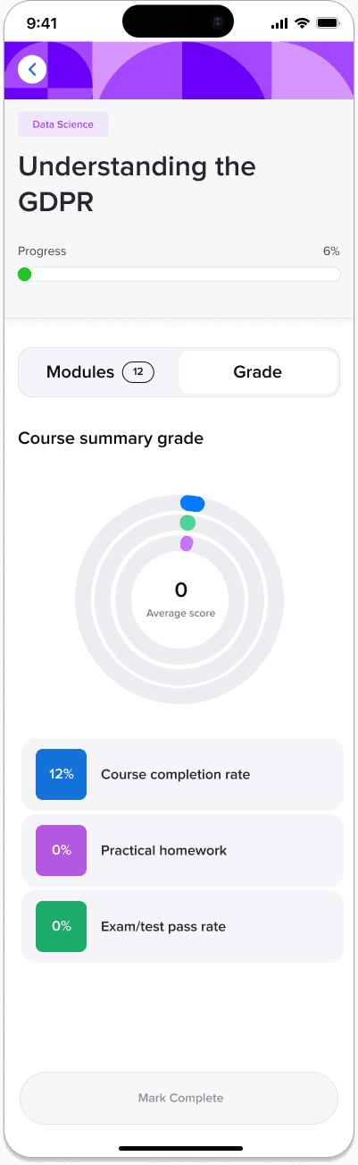
The screens below are from one of the final iterations, which was handed over for implementation and helped to achieve the set goals.


I'm very happy to work with such a challenging product. Once again, I've realized that the product's value determines its demand. By understanding the deep needs of users, I was able to re-engage them with the product.
I also made sure that the design system creates a consistent visual language even in areas where no designer has worked before. It was the right decision to develop the design system alongside the LMS because I could see how components interact with each other and create tokens within the product context.
Silver award | Muse award, category — Website - E-Learning
Winner | Summit International Awards
Next steps
The next step was transitioning to mobile development and adjusting the flow to match the desktop version. This was necessary to synchronize data and provide a consistent cross-functional user experience.