Home
Design System. Adding emotions
👩🏼💻 My influence
I redesigned the company’s design system to engage users through the emotional positioning of their gaming product.
😎 About the product
Drunk Robots is a blockchain-based NFT game that blends fun gameplay with the play-to-earn (P2E) model. In the game, players control robots that love to drink, fight, and scavenge for junk, which they can trade for weapons and accessories.
🌟 Details
I worked with a talented Staff Visual Designer, who was both an illustrator and co-founder. We had a wonderful collaboration, where he created the graphics and I designed the interfaces+motion.
I also collaborated with 4 product designers, 1 motion designer, 2 graphic designers, 1 UX-researcher, 1 UX writer, and cross-functional teams.
Discovery
📜 Problem Context
Drunk Robots needed a redesign of their design system to bring more emotion into the user experience and strengthen their brand.
This redesign aimed to enhance user engagement and improve key conversion metrics by creating a more emotionally resonant and cohesive experience across the platform.
Strengthening the emotional connection with users helps foster loyalty and drives better interactions at critical steps in the user journey.

Definition
🟥 Business and users' goals
Business goal
Increase NFT objects purchase rates by improving user engagement.
Stand out from competitors in the blockchain gaming space.
Build a strong emotional connection with players to boost retention.
Enhance brand recognition, leading to higher user acquisition and long-term engagement.
User goal
Get more drive
Have simpler navigation
Reduce the number of errors
More similarity to favorite games
My role
Project leadership
Guided the analysis and design process, Conduct and facilitate workshops.
Design system creation
Developed a brand statement and integrate it into the design system.
Cross-functional collaboration
Implement new concepts within technical constraints.
Strategy
🎯 The strategy I chose
1️⃣ Understand the user conversion path with current metrics
2️⃣ Identify the points where a user converts into a lead
3️⃣ Understand the audience's emotional triggers
5️⃣ Clarify and test the necessary emotions
7️⃣ Express emotions through decomposed graphical elements
9️⃣ Develop a new visual identity
🔟 Integrate into the design system and provide guidelines
Process
1️⃣ Understand the user conversion path with current metrics
For product familiarization, I analyzed quantitative metrics gathered from each step of the user journey. By combining these insights with the current business objectives, I formulated visual goals that could help improve business performance.
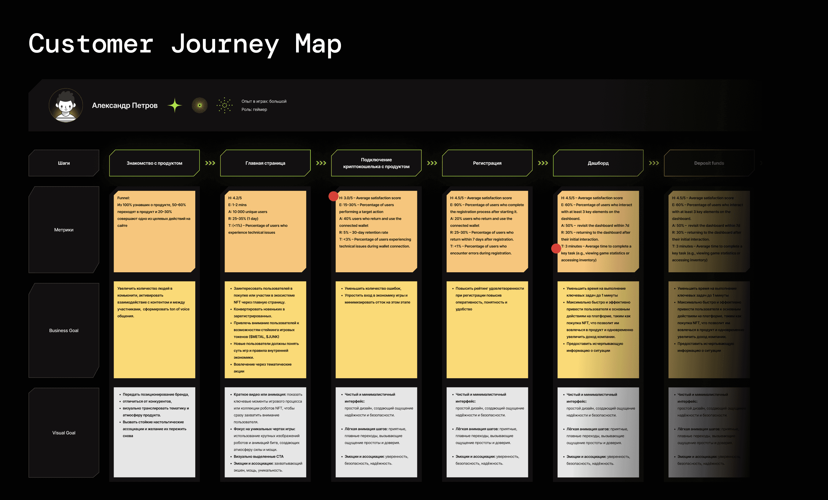
The numerical metrics also highlighted areas that required further exploration through qualitative research. For example, understanding the reasons behind the slow wallet connection process or the delayed discovery of key product actions.
These research results were considered during the development of new components for the design system.
2️⃣ Identify the points where a user converts into a lead
Lead conversion occurred at the point of purchasing a robot or Box. The metrics in this area were declining, so I took on the task of improving them by enhancing the visual impact on the user.
I also initiated the redesign process for these areas by providing the necessary components, organizing brainstorming sessions, and participating in testing.
4️⃣ Understand the audience's emotional triggers and their satisfaction
I studied the emotional, cultural, and nostalgic triggers of users through surveys and interviews. The community communication in Discord also naturally expressed the audience's tone of voice.
User interviews also helped identify what excites them most about the product, which turned out to be mainly fans of the co-founder’s work. The users collected NFTs, resembling Pogs players who cherished and stored every image in their collection.
5️⃣-6️⃣ Clarify and test necessary emotions
As a result of working on the mood board, it became clear that we needed to amplify emotions at the key lead conversion points.
To determine the next steps, I needed to test through card sorting how well the images actually conveyed the emotions that the user wanted to experience.
7️⃣ Express emotions through decomposed graphical elements
Nostalgic emotions and user associations helped me gain an understanding of the missing graphic elements in the design system.
9️⃣ Develop a new visual identity
Graphic elements were integrated into many parts of the product, but the most thoroughly developed areas were the lead conversion points — robot purchases and BOX openings.
To present my solution to the team, I created a presentation that combined video storytelling with the ability to switch between slides.
*For my portfolio, I merged everything into a single video.
This approach helped me demonstrate the importance of motion animations and effectively convey the information.
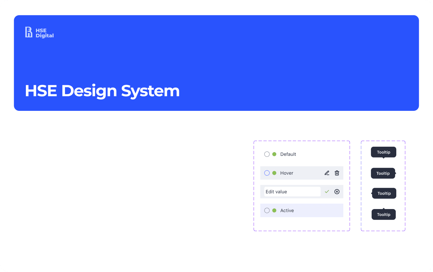
🔟 Integrate into the design system and provide guidelines
In the end, I refined the design system, strengthened the brand, and increased conversion at key user steps. Additionally, I participated in the redesign of the homepage and provided the necessary components for the design system.
🎯 Final visual result
The final solution reflects the product's brand and has a modern appearance.
Additionally, I created a dark theme.
9️⃣ My influence on users
Внедрение многоязыковой поддержки и визуальных подсказок позволило сотрудникам взаимодействовать с приложением без необходимости частых личных встреч, снизив количество ежедневных совещаний с 4 до 2.
Функция ежедневного обзора команды позволила сотрудникам быстро видеть свои задачи и роли на день, что снизило время на планирование и координацию задач на 20%.
Внедрение функционала для предоставления детальной информации о задачах, включая шаги выполнения и необходимые ресурсы, что уменьшило количество запросов на дополнительную информацию на 40%.
Связь задач с данными о доме позволила сотрудникам получать полную информацию о контексте задачи, что повысило точность выполнения заданий и снизило количество ошибок на 15%.
🎯 KPI achived
Increase in productivity
Employee productivity increased by 15% thanks to more efficient task management and reduced coordination time.
Numbers of tasks complited
Number of tasks completed by staff per day increase by 15%.
Reduction in task completion time
The time required to complete key tasks decreased by 25% thanks to the simplification of workflows and improved interface.
Increase in user satisfaction
User surveys showed a 35% increase in satisfaction with the application's interface and functionality.
Reduction in error rates
The number of errors made while performing tasks decreased by 20% due to clear instructions and an improved component system.
🔟 Documentation
As a result of my work, guidelines for designers were documented to ensure continued product development. These principles will enable the creation of user-friendly, intuitive, and aesthetically pleasing solutions. Documentation for developers was also created to ensure seamless integration into the code.
💡 Lessons I learnt
1️⃣ The most challenging aspect of this project for me was gaining trust. The established team was hesitant to accept someone introduced as an expert in design systems. I believe the significant change happened after the first workshop, and I find this method to be the most effective.
2️⃣ I realized that improving a product is similar to treating a living organism. For example, filling a cavity without proper treatment would be as reckless as adding to a design system without refining the previous version.
3️⃣ Clearing legacy is a complex process involving both designers and developers. It requires collaboration to update outdated components while maintaining functionality. Together, they balance innovation with stability, ensuring a smooth transition to a more efficient system.