Home
Design System for iOS App
👩🏼💻 My influence
I created a design system for an iOS application, integrating it with four existing products. To achieve this, I had to:
improve the existing design system,
establish principles for future work,
participate in the app development process, as well as in research, testing, and data analysis.
I made a substantial impact on the product's brand and company processes, while also training the design team to deliver an exceptional user experience.
😎 About the product
There were four products unified by a single goal — managing multiple houses on a landlord's estate. All four products were designed for the family and their butler, but there was a lack of a mobile application for the staff.
🌟 Details
To enhance the design system, I joined the HouseOn office and collaborated with 8 developers, 6 product designers, and 4 design system designers to meet their needs and ensure smooth and efficient workflow.
🌟 Facts about HSE Design System
4 products
HouseData service
HouseSecurity service
HouseOn service
HouseEvent
50 users
designers+developers
100
components


Discovery
📜 Problem Context
Due to the lack of digital communication with the staff, the butler had to hold meetings twice a day to coordinate the staff's actions. Additionally, the human factor and work-related stress impacted the process. Therefore, the decision was made to systematize and digitize the process, minimizing the challenges the staff faced at work.

Definition
🟥 Business and users' goals
Business goal
Accelerate staff productivity
Reduce the number of errors and misunderstandings
Digitize financial reporting
Highlight information about the house available to staff
Simplify communication between team members
Increase staff satisfaction
User goal
Simplify the workflow
Minimize personal interaction
Receive comprehensive information about the task
Get help when not knowing the language
Have clear instructions for the task
My role
Project leadership
Guided the analysis and design process, establishing project plans and timelines.
Design system creation
Developed a comprehensive design system guide, ensuring consistency across the product.
Cross-functional collaboration
Worked closely with business and software teams to align goals and implementations.
🔍 What I observed after the initial audit
1) The existing design system lacks technical flexibility
What prevented designers from using the components so that they often detached them and created their own versions.
2) The low reuse of components leads to inconsistencies across different products
3) The inconsistent UI and UX journey for guest users
4) The architecture for the mobile application was not yet ready
That left unclear what functionality was expected and what components would be needed.
Strategy
🎯 The strategy I chose
1️⃣ Understand and Define
Analyze existing solutions and provide a report to the team and stakeholders.
2️⃣ Fix existing problems
Address the identified issues.
Identify the existing standards.
3️⃣ Fill in the gaps
Rebuild the product structure to integrate it with the mobile app.
Form a clear understanding of the mobile app’s functionality.
Document the standards, guidelines, and brand principles.
4️⃣ Design
Create components in alignment with the established standards and the needs of the design teams.
5️⃣ Deliver
Provide detailed specifications for developers.
Support the development and testing process of the components.
Process
1️⃣ Understand and Define
I documented the user journey through screens and highlighted the inconsistency of components.

I identified the issues and demonstrated them to the team and stakeholders.
Most of the inconsistencies in the user journey occurred for guests, who received an invitation and joined the landlord’s network upon arrival.

2️⃣ Fix existing problems
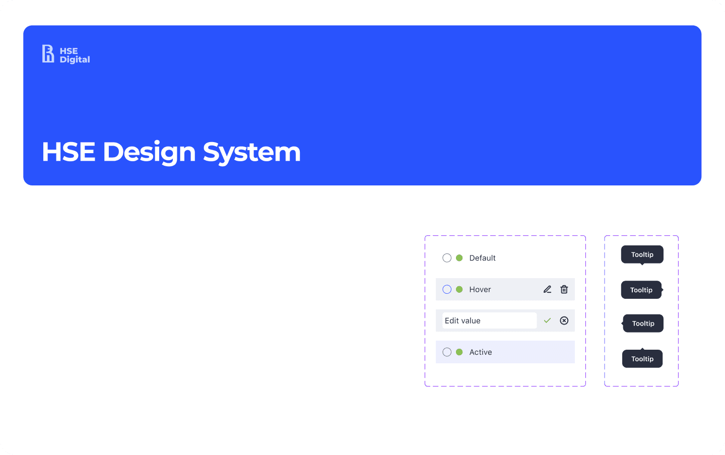
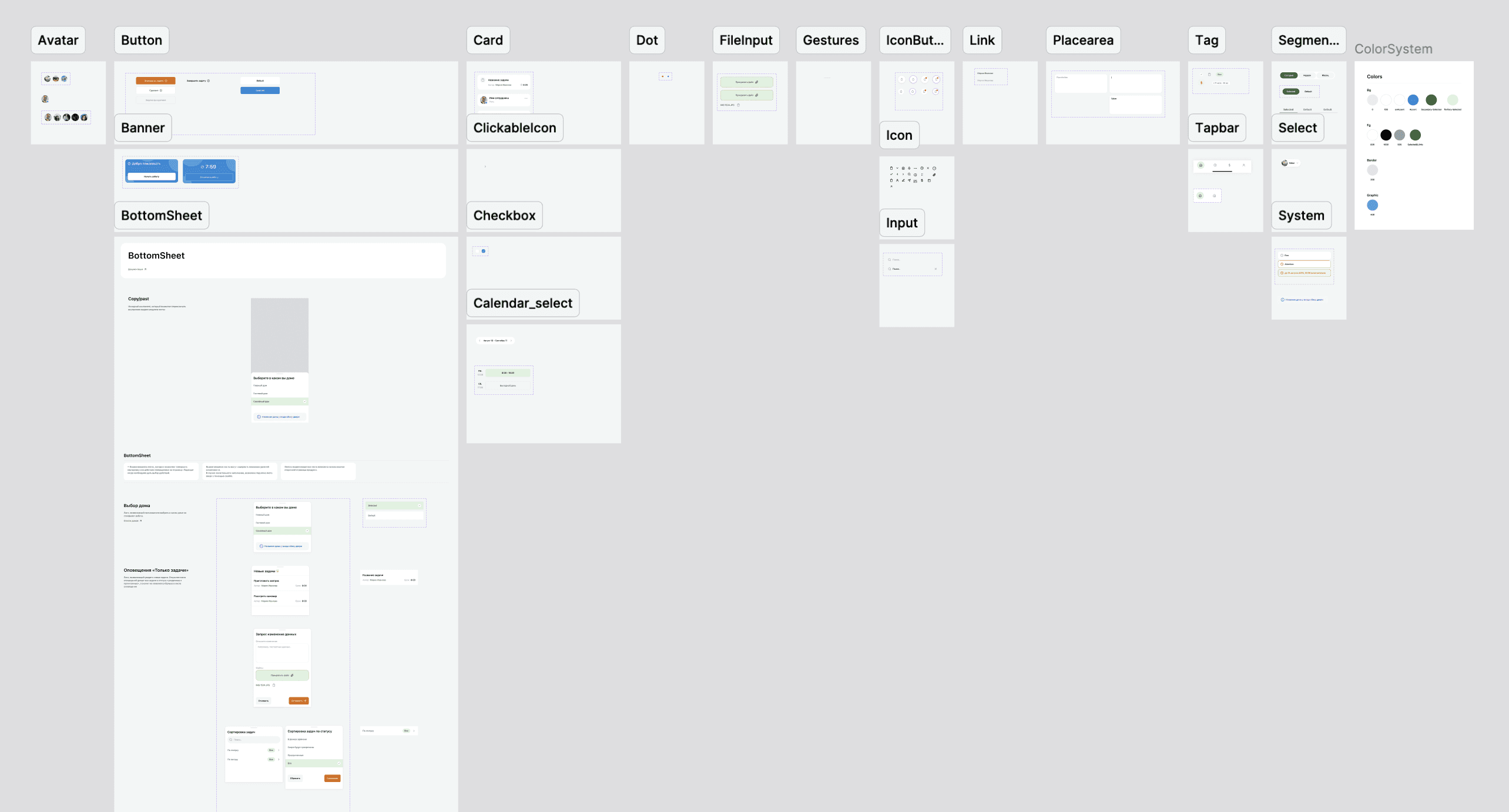
To address these issues, I proposed selecting the most up-to-date solutions and establishing them as standards to be followed in the new product. Based on these standards, I refined the existing components.
I also defined the requirements for developing components in Figma to make them more flexible for changes. Specifically, I suggested adopting a naming system with layers such as bg, fg, and border, and for the mobile solution, adding a Level layer. Additionally, I proposed separating functional colors from content-based ones to make changes more predictable.
Challenges
3️⃣ Fill in the gaps
Since tasks for the staff were assigned by the administrator in the desktop version of the product, and the staff could also access the HouseData service, I needed to rebuild the product architecture. This allowed me to connect the functionality of the current product with the future one.

4️⃣ Design and evolve
I assembled the first components without documentation for quick testing of product stories.
Together with the researchers, I gathered the unique needs of users, built use cases, and integrated them into the existing components.

5️⃣ User research results
As a result of in-depth interviews and data analysis, we uncovered many insights that later influenced the product.
Frequent conflicts
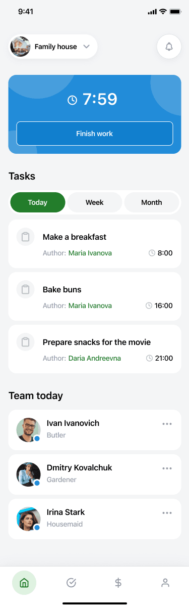
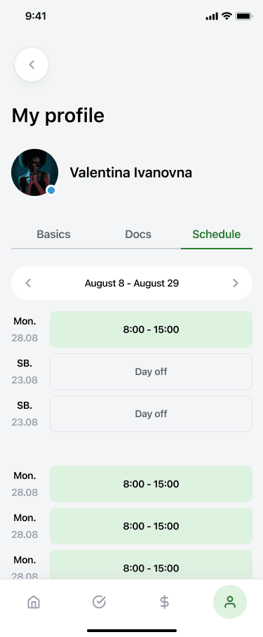
The app should include a daily team overview feature, allowing them to see their colleagues and supervisors for the day.
Not everyone is proficient in the language
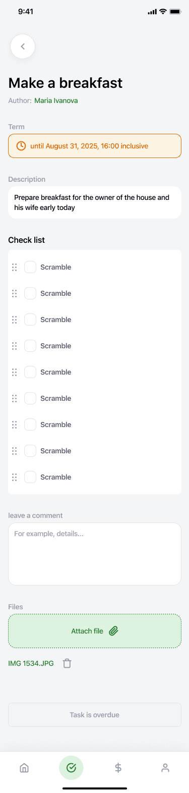
The app must include multilingual support or visual cues (icons, images) to ensure tasks are clearly understood regardless of language barriers.
Limited time for interaction
The app should allow for easy task reassignment and real-time updates. This ensures that staff can quickly adapt to new roles or duties during their shift.
Low digital literacy
The interface should be as intuitive and user-friendly as possible, with large buttons, clear icons, and guided interactions that don’t require advanced technical skills.
Multiple tasks in different houses
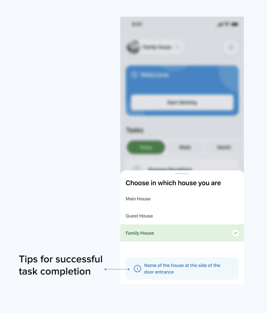
Provide a clear indication of which house each task is located in.
6️⃣ My influence on brand
The initial concept was proposed by the product design team. I refactored it, placing emphasis on the need to enlarge elements to meet WCAG standards and adhere to previously established design principles.
I also conducted training on compositional layout of elements, which improved clarity and readability.
Additionally, I held several sessions where we reviewed the user’s journey at each stage and identified their informational needs. This allowed us to significantly clean up the interface by removing irrelevant elements.
As a result of these changes, we arrived at the following concept.

7️⃣ Test and iterations
The design system played a key role in enhancing the customer experience (CX). Ux-reseacher and me, conducted regular user research, analyzing behaviors and collecting feedback. Based on this data, we implemented improvements that made interfaces more intuitive and user-friendly.
One example is that new employees often don’t know how to distinguish one house from another. To address this, small badges were placed near the doors, which we also remind users about in the interface.
As a result, we significantly reduced the time users needed to complete key actions. This supported the business’s strategic goals.
Result
8️⃣ My influence on business and department
My work on the design system extended beyond just the product development team, influencing the entire department. For example, by standardizing design elements and processes, I facilitated smoother collaboration between the design, development, and operations teams. This integration led to more efficient cross-departmental workflows and a unified approach to project execution.
A key initiative was the development of comprehensive design guidelines that were adopted department-wide. These guidelines improved consistency across various teams, reduced the need for repeated revisions, and streamlined communication. As a result, the department saw a 30% increase in productivity and a significant reduction in project turnaround times.
Additionally, I organized training sessions for various teams, including developers, HR representatives, and stakeholders, to ensure their alignment with the new design standards. This fostered a unified understanding of the product’s vision and goals, leading to improved cross-departmental synergy and more effective implementation of design changes across the company.
🎯 Final visual result
The final solution reflects the product's brand and has a modern appearance.


Additionally, I created a dark theme.
9️⃣ My influence on users
The implementation of multilingual support and visual cues enabled employees to interact with the application without the need for frequent in-person meetings, reducing the number of daily meetings from 4 to 2.
The team’s daily overview feature allowed employees to quickly see their tasks and roles for the day, which decreased time spent on task planning and coordination by 20%.
The introduction of functionality for providing detailed task information, including steps and required resources, reduced the number of additional information requests by 40%.
Linking tasks to home-related data allowed employees to access complete information on task context, which improved task accuracy and reduced errors by 15%.
🎯 KPI achived
Increase in productivity
Employee productivity increased by 15% thanks to more efficient task management and reduced coordination time.
Numbers of tasks complited
Number of tasks completed by staff per day increase by 15%.
Reduction in task completion time
The time required to complete key tasks decreased by 25% thanks to the simplification of workflows and improved interface.
Increase in user satisfaction
User surveys showed a 35% increase in satisfaction with the application's interface and functionality.
Reduction in error rates
The number of errors made while performing tasks decreased by 20% due to clear instructions and an improved component system.
🔟 Documentation
As a result of my work, guidelines for designers were documented to ensure continued product development. These principles will enable the creation of user-friendly, intuitive, and aesthetically pleasing solutions. Documentation for developers was also created to ensure seamless integration into the code.
💡 Lessons I learnt
1️⃣ The most challenging aspect of this project for me was gaining trust. The established team was hesitant to accept someone introduced as an expert in design systems. I believe the significant change happened after the first workshop, and I find this method to be the most effective.
2️⃣ I realized that improving a product is similar to treating a living organism. For example, filling a cavity without proper treatment would be as reckless as adding to a design system without refining the previous version.
3️⃣ Clearing legacy is a complex process involving both designers and developers. It requires collaboration to update outdated components while maintaining functionality. Together, they balance innovation with stability, ensuring a smooth transition to a more efficient system.